
Responsive web design is all about making your website look great on all devices, from large desktops to small smartphones. The Divi theme is one of the best tools for creating responsive websites. While Divi comes with built-in breakpoints, adding custom breakpoints gives you more control over how your website looks on different screen sizes. This tutorial will show you how to add custom breakpoints to your Divi website using simple steps.
We’ll also discuss popular Divi products like Divi Wireframes, Divi Layouts, Divi Hero Sections, and Divi Child Theme to help you see how custom breakpoints can make these products even better.
What Are Breakpoints, and Why Are They Important?
Breakpoints are specific screen widths where your website changes its design to look good on different devices. For example:
- A Divi Hero Section might look perfect on a laptop but too crowded on a smartphone.
- Your Divi Layouts may need adjustments for larger screens to avoid looking stretched.
Custom breakpoints allow you to fix these issues and make your website look great everywhere.
Step 1: Add a Custom Class to the Module
To add custom breakpoints, you first need to tell Divi which part of your page you want to modify.
- Open Divi Builder: Start by editing the page in the Divi Builder.
- Select the Module: Click on the gear icon of the section, row, or module you want to customize.
- Go to the Advanced Tab: In the module settings, switch to the Advanced tab.
- Add a CSS Class: In the "CSS Class" field, enter a unique name. For example, you can type
custom-breakpoints.
This class will help you target the module with your custom CSS.
Step 2: Add a Code Module
Next, you’ll need to add a Code Module to the page. This is where you’ll write your custom CSS code.
- Add a Code Module: Click the plus (+) icon in the Divi Builder and select the Code Module.
- Choose CSS: In the Code Module settings, make sure you are writing CSS code. This is where you’ll create your custom breakpoints.
Step 3: Write Custom CSS for Your Breakpoints
Now, let’s write the CSS code to create a custom breakpoint. A media query is used to apply specific styles to certain screen sizes.
Example: Custom Breakpoint for Wide Screens
If your Divi Wireframe page looks too stretched on large screens, you can create a breakpoint for widths between 1366px and 1920px.
Example: Custom Breakpoint for Small Screens
If your Divi Hero Section looks cramped on mobile devices, use a breakpoint for screens smaller than 768px.
Step 4: Save and Test
- Save Your Changes: Save your Code Module and update the page.
- Preview the Page: Open the page in your browser and resize the window to see how the design changes at different screen sizes.
- Test on Devices: Check the page on real devices like tablets and phones to ensure it looks good.
Advanced Tips
1. Apply Global Custom CSS
Instead of adding a Code Module for every page, you can add the custom CSS globally.
- Go to Divi Theme Options > Custom CSS.
- Paste your custom CSS code there.
This makes your custom breakpoints work across the entire website, perfect for projects using Divi Wireframes, Divi Layouts, or Divi Hero Sections.
2. Use a Divi Child Theme
For advanced customization, you can create or use a Divi Child Theme. A child theme allows you to safely add custom code without affecting the parent theme. Add your CSS for custom breakpoints in the child theme’s style.css file.
- Go to your WordPress dashboard.
- Navigate to Appearance > Theme Editor.
- Open the
style.cssfile in your Divi Child Theme and paste your CSS code.
This method ensures your customizations stay intact, even if you update the parent Divi theme.
Real-Life Example: Improving a Divi Hero Section
Let’s say you have a Divi Hero Section with a big heading and a button. On smaller screens, the text might be too large, and the button may lose alignment. Here’s how to fix it:
CSS Code:
This CSS makes the hero section’s text smaller and ensures the button fits well on mobile devices.
How Custom Breakpoints Improve Divi Features
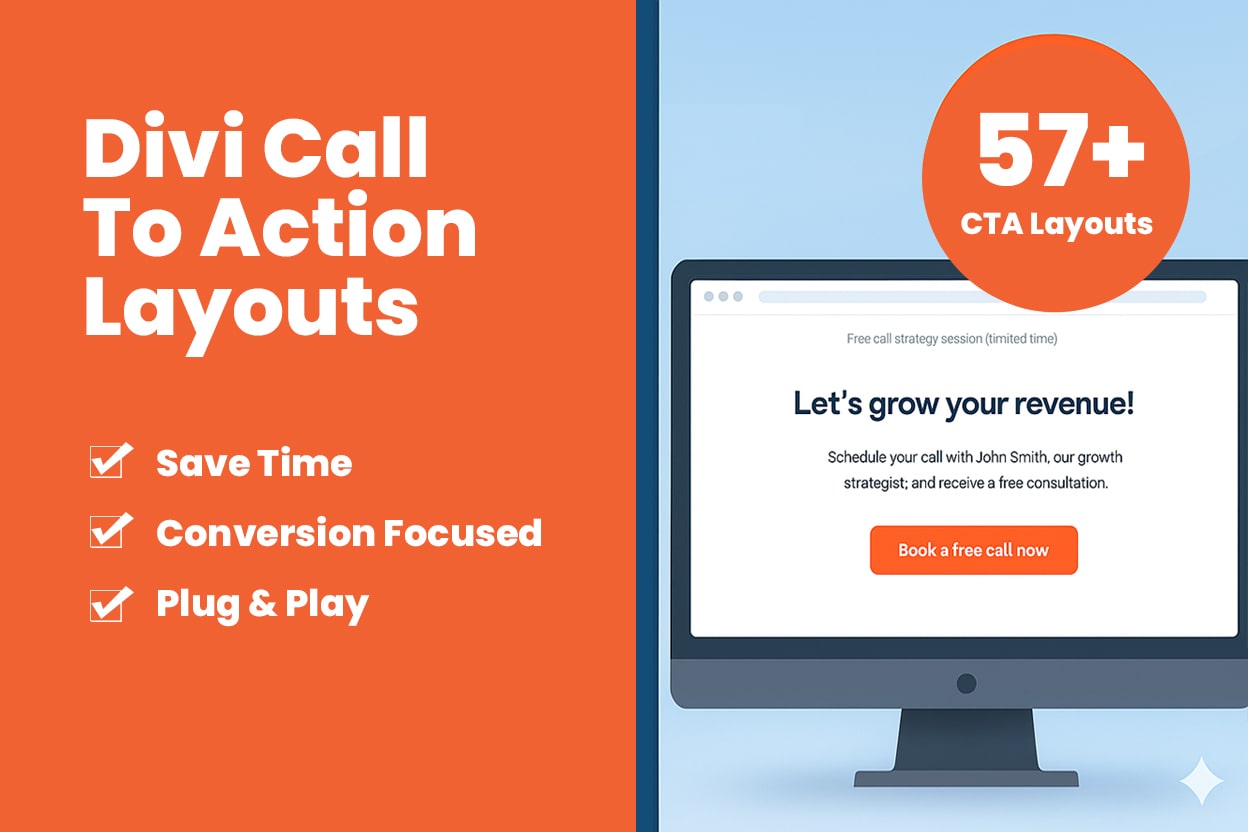
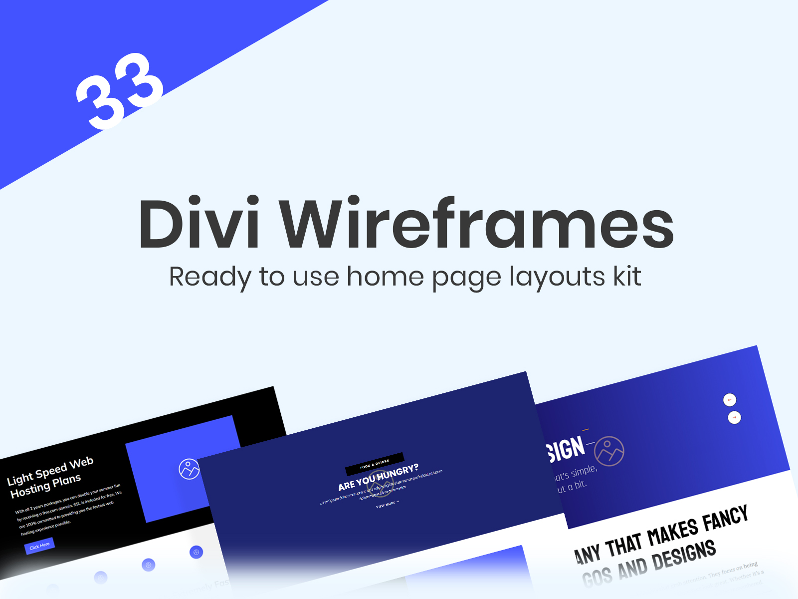
- Divi Wireframes:
Test how your prototypes look at different screen sizes and fine-tune them with custom breakpoints. - Divi Layouts:
Ensure your layouts work flawlessly on all devices, from desktops to phones. - Divi Membership:
Adjust membership forms and content for better usability on small and large screens. - Divi Hero Sections:
Create beautiful, responsive hero sections that stand out on any device. - Divi Child Theme:
Use a child theme to manage all your customizations in one place, ensuring future-proof designs.
Conclusion
Adding custom breakpoints in Divi is a straightforward way to improve your website’s responsiveness. Whether you’re working on Divi Wireframes, Divi Layouts, Divi Hero Sections, or a Divi Child Theme, custom breakpoints help you make your designs look perfect on any device.
By following this guide, you can take full control of your website’s appearance and provide a better experience for all your visitors. Try it out today and see the difference!