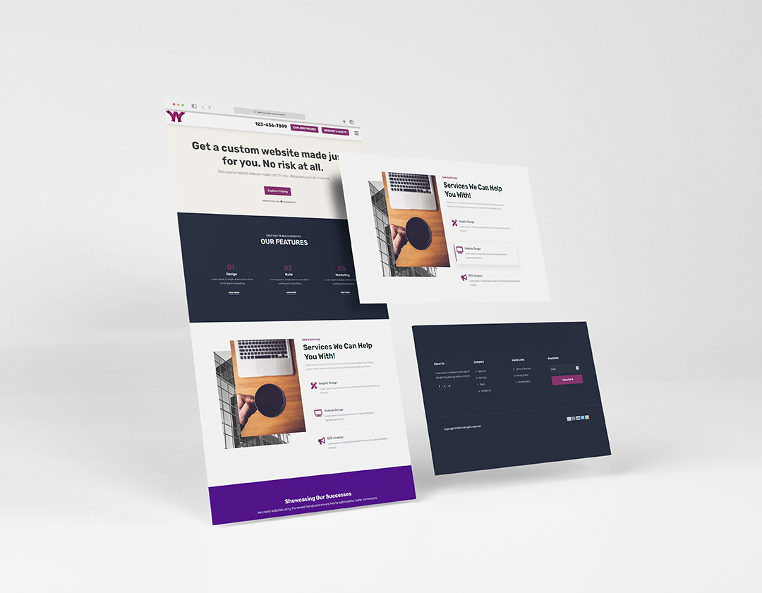
The Divi 5 CSS Grid Editor is a visual layout tool that lets you create and customize CSS Grid layouts directly inside the Divi Visual Builder. You can visually arrange content into rows and columns, resize grid areas, adjust spacing, and position modules with greater precision. This makes it easier to create advanced and responsive WordPress layouts without having to write complex CSS manually.
What is Divi 5 Grid?
Divi 5 Grid is a flexible CSS Grid-based layout system built into Divi 5. It gives web designers more control over columns, rows, gaps, positioning, and the size of individual grid items. Compared with traditional layouts, Divi 5 Grid makes it easier to create unique website designs and responsive page structures directly within the Divi Visual Builder.
How does CSS Grid in Divi 5 work?
CSS Grid in Divi 5 lets you organize Divi modules and content within a customizable grid structure. You can define where elements appear, control how many columns and rows they use, adjust gaps, and allow elements to span multiple grid cells. These visual controls make it possible to build complex layouts while keeping the design process inside the Divi 5 Visual Builder.
Can I use the Divi 5 CSS Grid Editor without coding?
Yes. One of the main advantages of the Divi 5 CSS Grid Editor is that you can create advanced grid layouts visually without manually writing complex CSS. Designers can use the Visual Builder to position and adjust grid elements while seeing the changes in real time. This makes CSS Grid more approachable for WordPress users who want greater layout control without being experienced with CSS.
What can I build with the Divi 5 Grid Editor?
The Divi 5 Grid Editor can be used to create a wide variety of custom layouts, including portfolios, image galleries, service sections, product displays, card grids, feature sections, and landing pages. Because CSS Grid provides more positioning flexibility, you can create layouts that go beyond standard rows and columns while maintaining a responsive structure for different screen sizes.
Is the Divi 5 Grid responsive?
Yes. Divi 5 Grid can be used to create responsive layouts that adapt to different screen sizes, including desktops, tablets, and smartphones. Designers can adjust the grid structure and positioning to create layouts that remain visually balanced across devices. This makes CSS Grid in Divi 5 useful for building modern WordPress websites with responsive designs.
How does the Divi 5 Visual Builder help with CSS Grid?
The Divi 5 Visual Builder makes CSS Grid easier to use by providing visual controls for creating and modifying grid layouts. Instead of relying entirely on custom CSS or external code, you can make layout changes directly within the builder and see the results while you design. This visual approach can significantly simplify the process of creating custom CSS Grid layouts in Divi 5.
What are the benefits of using CSS Grid in Divi 5?
The biggest benefit of CSS Grid in Divi 5 is greater control over website layouts. You can manage rows, columns, gaps, positioning, and element spans with more flexibility than traditional layout structures. This allows Divi users to create more creative and complex designs while reducing the need for custom CSS and making the overall design workflow more visual.
Is Divi 5 Grid better for custom layouts?
Divi 5 Grid is particularly useful when you need more flexibility than a traditional column-based layout can provide. It allows designers to create unique compositions, control the placement of individual elements, and build more advanced responsive structures. For custom WordPress websites, the Divi 5 CSS Grid Editor provides a visual way to achieve layouts that previously required more manual CSS work.