
You built a beautiful page in Divi, but visitors land on it and just… leave. No clicks, no sign-ups, no sales. That usually means one thing: your call to action divi setup isn’t pulling its weight. A weak button or a buried CTA can quietly kill conversions on an otherwise solid design.
Good news: Divi already gives you the tools to fix this. The built-in Call to Action module lets you pair a headline, description, and button into one focused block designed to move visitors toward a decision. This guide shows you exactly how to add it, style the call to action button so it stands out, and adjust settings so it fits your layout instead of fighting it.
We’ll walk through placing the module on a page, customizing colors, text, and spacing, and building a divi call to action button that actually gets clicked. You’ll also see real divi call to action examples pulled from working sites, plus tips for using CTAs in menus and hero sections. If you’d rather skip the setup work entirely, DiviHat’s library of Divi hero section layouts includes sections built with conversion-ready CTAs already in place.
What is the Divi Call to Action module?
The Divi Call to Action module is a pre-built content block that bundles a headline, a paragraph of supporting text, and a clickable button into one unit. Instead of stacking a Text module on top of a Button module and wrestling with spacing until it looks right, you drop in one module and Divi handles the layout for you. That’s the whole point of a call to action divi element: it removes friction from both the visitor’s decision and your own build process.
A good CTA module does one job well: it gives the visitor exactly one obvious next step.
How it differs from other Divi elements
People often ask why they’d use this module instead of just placing a call to action button on its own. The answer is structure. The Button module gives you a single link with no room for context, while the Blurb module gives you text and an icon but no strong action element. The CTA module sits between them, purpose-built for the moment you want someone to click.
| Module | Includes headline | Includes body text | Includes button | Best use case |
|---|---|---|---|---|
| Button module | No | No | Yes | Repeating a link inside existing content |
| Blurb module | Yes | Yes | Optional icon, no button | Feature highlights, benefits lists |
| Call to Action module | Yes | Yes | Yes | Standalone conversion blocks, section breaks |
If you’re building a divi call to action button that needs context around it (why should they click?), the CTA module saves you from manually assembling three separate modules and aligning them by hand.
Where you’ll find it and what it controls
Inside the Divi Builder, you’ll find the module listed simply as "Call To Action" when you click the plus icon to add a new module to any row. Once it’s on the page, its settings split into three familiar tabs: Content, Design, and Advanced. The Content tab holds your title, body text, button text, and button URL. The Design tab covers background color or image, text color, button styling, spacing, and border radius. The Advanced tab handles custom CSS, visibility rules, and animation, useful if you want the module to fade in as visitors scroll to it.
Because everything lives in one module, changes cascade cleanly. Adjust the background color once, and your title, text, and button all sit on that new backdrop without extra tweaking. This is also why the module works so well for the divi call to action examples you’ll see later in this guide, ranging from simple email opt-in bars to full-width sections with background images and overlay text.
One practical note before you start building: the module is available on every Divi page by default, no plugin required, since it ships with the core theme builder. If you’re short on time and want a head start, DiviHat’s ready-made Divi 5 layouts already include CTA elements styled and positioned by designers, so you can swap in your own text and colors rather than building the section from a blank row. Either way, understanding what the module actually contains, and how it differs from a plain button, sets you up to make smarter choices in the next steps.
Step 1. Add the Call to Action module to your page
Open the page where you want the CTA to live, then launch the Divi Builder from the top of the WordPress editor. Whether you’re working on a brand new page or dropping a CTA into an existing layout, the process is the same: you need a row to hold the module before Divi will let you place it. If the page is blank, choose a single-column row layout first since the Call to Action module works best on its own, not squeezed next to other content.
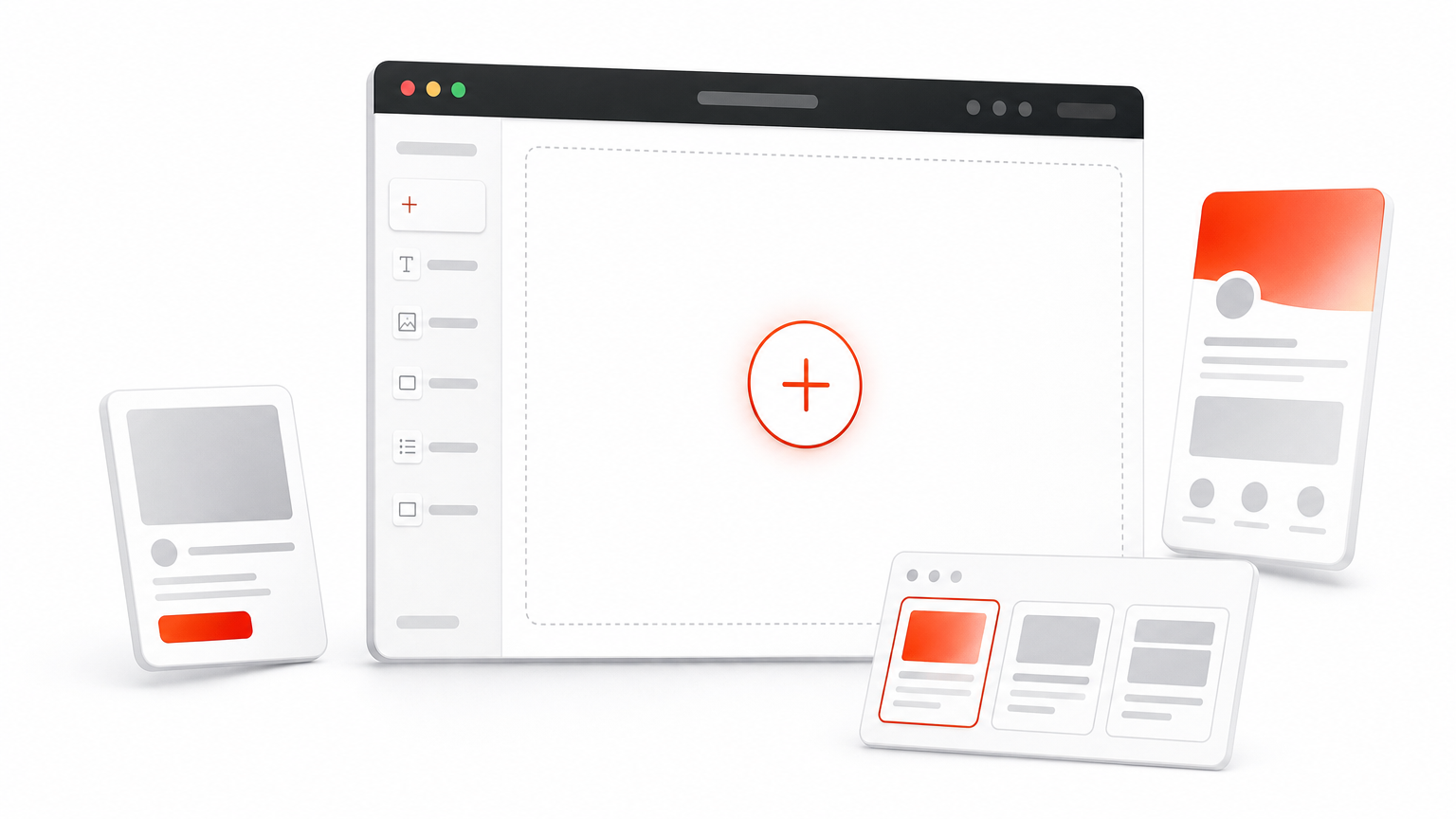
Adding the actual module only takes a few clicks once the row exists.
- Click the gray plus icon inside the row where you want the CTA to sit.
- Search "Call To Action" in the module search bar, or scroll to find it under the standard modules list.
- Click the module to insert it. Divi loads it with placeholder text so you can see the default styling immediately.
- Open the module settings by clicking the module once it’s placed on the page.
Placement matters as much as design: a CTA buried below three other sections gets scrolled past before it gets read.
Choosing the right spot on the page
Getting the divi call to action module onto the page is easy. Deciding where it goes is what actually affects conversions. Placing it directly after your strongest selling point, whether that’s a testimonial, a pricing table, or a feature list, works better than tacking it onto the very bottom of a long page where fewer visitors scroll. If you’re building a landing page, many designers place one CTA near the top (right after the hero) and a second one at the very end, so visitors who decide early and visitors who need more convincing both get an obvious next step, one of several Divi landing page tips that lift sales.
Section background also plays a role here. Full-width sections with a contrasting background color make the module stand out from the content above and below it, which is part of why so many divi call to action examples use a darker or brand-colored backdrop rather than blending into a white page. You don’t need to finalize colors yet since that comes in Step 3, but keep in mind as you place the module that it should visually interrupt the page just enough to catch attention without feeling out of place.
Step 2. Add your title, text, and button
With the module placed, open its Content tab and you’ll see three fields waiting: Title, Body, and Button Text, plus a spot to paste your Button URL. This is where the call to action divi module earns its keep, since every piece of copy you write here directly shapes whether someone clicks or scrolls past. Swap out the placeholder title first. Keep it short, five to eight words, and make it about the visitor’s outcome rather than your product. "Start Your Free Trial Today" beats "Our Amazing New Feature" every time because it tells people what happens next.
The button copy does more conversion work than the headline, so write it last and revise it the most.
Next comes the body text field, which sits just below the title. This is not the place for a paragraph of marketing copy. One or two sentences is plenty, enough to remove hesitation without making visitors read before they act. Answer the objection that’s stopping someone from clicking: is it price, time commitment, or risk? A line like "No credit card required, cancel anytime" does more to move someone toward the divi call to action button than three extra sentences of feature description.
Writing button text that gets clicked
The button field defaults to generic text like "Click Here," and you should replace that immediately. Generic labels blend into the page because visitors have seen them a thousand times on other sites. Specific, action-first phrasing works better because it tells people exactly what they’re getting.
Weak: Click Here
Weak: Submit
Better: Get My Free Layout
Better: Start Building for $89
Better: Join 4,800+ Members
Notice the better examples name a benefit or a number. Specificity builds trust, and trust is what gets the click. If you’re building a divi call to action button for a paid product, testing exact pricing in the button text ("Start for $29/mo") often outperforms vague phrases like "Learn More," since it pre-qualifies visitors before they land on a checkout page.
Once your text is set, paste the destination URL into the Button URL field. Double-check it points to the right page, especially if you’re linking to a checkout, signup form, or another internal page rather than an external site. A broken or mismatched link here undoes all the work you just put into the copy, so test the click yourself before moving to styling.
Step 3. Style the module to match your brand
Open the Design tab and you’ll find the settings that turn a generic module into something that looks like it belongs on your site. Start with the background, since that choice sets the tone for everything else in the section. A solid brand color, a three-color gradient background, or a full background image all work, but whatever you pick should contrast with the sections above and below it. This is where a divi call to action module stops looking like a default Divi block and starts looking like part of your design system.
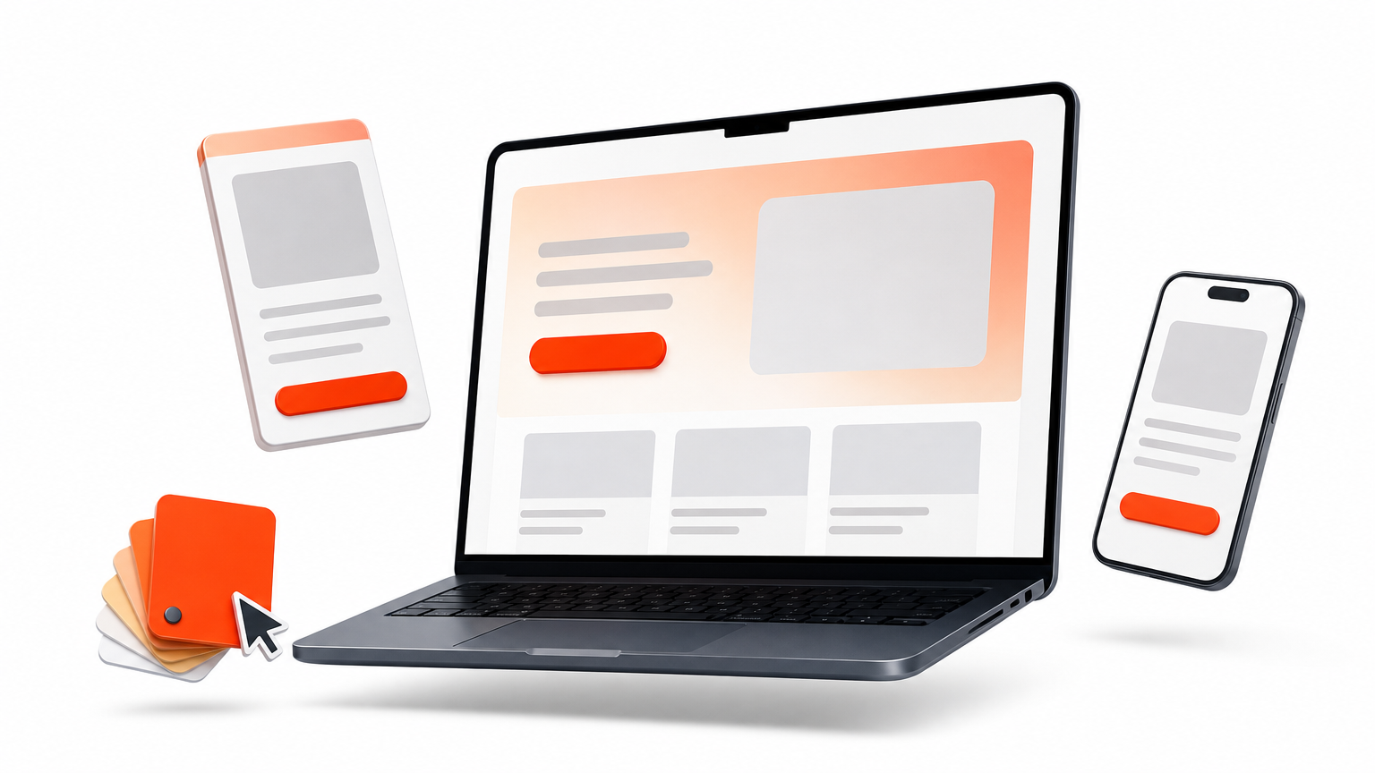
A CTA that matches your brand colors but ignores contrast still gets ignored, make the button impossible to miss.
Button styling that actually stands out
Scroll down to the Button Styles section within the Design tab, and you’ll see controls for button color, text color, border radius, width, and a hover state. This is the single most important styling decision in the whole module, since the button is what people need to see first. Set a button color that contrasts sharply against the module background rather than blending in. A pale blue button on a pale gray background disappears; a bright orange or high-contrast white button on a dark background pulls the eye immediately.
Use this quick checklist before moving on:
- Button color contrasts with the section background, not just the page background
- Hover state changes color or adds a slight shadow, so clicking feels responsive
- Border radius matches the rounded or square style used elsewhere on your site
- Button text size is large enough to read at a glance on mobile
Spacing, alignment, and text color
Beneath the button controls, you’ll find spacing settings for padding and margin, along with text alignment options for the title and body copy. Generous padding above and below the module, usually 60 to 100 pixels on desktop, gives the CTA room to breathe and reinforces that it’s a distinct section, not an afterthought squeezed between paragraphs. Centered text alignment tends to work best for standalone CTA sections, since it draws the eye straight down to the button rather than letting it wander to one side.
Text color deserves a final check once your background is set. Divi won’t warn you if your title text is nearly invisible against a busy background image, so preview the module on both desktop and mobile before publishing. A call to action button divi users can’t read clearly is a button they won’t click, no matter how good the copy is.
Step 4. Turn a menu item into a CTA button
Sometimes the highest-converting CTA on your site isn’t in the body of a page at all, it’s sitting in your Divi header and navigation menu where every single visitor sees it, on every page, before they even scroll. Divi doesn’t ship a dedicated "menu CTA" toggle, but you can turn any menu item into a styled button with a CSS class and a few lines of custom code. This trick works especially well for a recurring divi call to action button like "Get Started" or "Book a Call" that you want visible site-wide, not just on one landing page, and the same idea applies when you want a button that opens a HubSpot form popup.
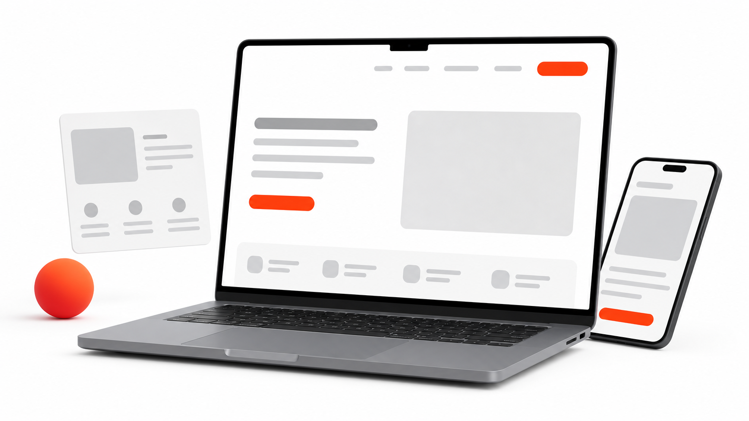
The menu bar is prime real estate: put your best CTA there and it works on every single page view, not just one.
Adding the CSS class in the WordPress menu editor
Start in your WordPress dashboard under Appearance > Menus, not inside the Divi Builder. Click the menu item you want to convert, and if you don’t see a CSS Classes field, click Screen Options at the top of the page and check the box to enable it.
- Go to Appearance > Menus and select the menu your header uses.
- Click the arrow on the menu item to expand its settings.
- Type a class name into the CSS Classes field, something simple like
nav-cta-button. - Save the menu.
Styling the button with custom CSS
With the class in place, head to Divi > Theme Options > General, scroll to the Custom CSS box, and paste in styling rules targeting that class. This is where you control color, padding, and rounded corners without touching a single template file:
.nav-cta-button a {
  background-color: #ff6b35;
  color: #ffffff !important;
  padding: 10px 20px;
  border-radius: 4px;
  font-weight: 600;
}

.nav-cta-button a:hover {
  background-color: #e85a2a;
}
Adjust the hex codes to match your brand and preview the change immediately in the header. Because this menu button lives outside the Call to Action module, it won’t inherit any of the styling you set up in Step 3, so double-check contrast and mobile tap size separately. A menu CTA that’s too small to tap comfortably on a phone screen loses clicks just as fast as a poorly worded one, so test it on an actual device, and consider custom breakpoints in the Divi theme if your header needs finer control, before calling it done.
Putting your Divi CTA to work
Getting a call to action divi module right comes down to a handful of decisions: clear placement, sharp copy, contrasting colors, and a button people can actually read at a glance. None of that requires custom code or a design background, just the willingness to test your button text and preview it on mobile before you publish.
Start small if you’re not sure where to begin. Add one CTA after your strongest section, write a button label that names a specific outcome, and check the contrast against your background. Once that one converts, apply the same pattern to your menu button and any other landing pages that need it.
Skipping the build entirely is also fair game. If you’d rather start from a proven design than a blank module, browse our ready-made call-to-action layouts for Divi, built by designers who’ve already solved the contrast, spacing, and copy problems for you.