The best webinar landing page templates share four traits: one goal, a registration form you can see without scrolling, a clear date, time, and time zone, and proof that the speaker is worth an hour. Pick the single-goal page for your first webinar and the speaker-led page if your name sells the session. Use the agenda page for harder sells, the countdown page for fixed live dates, and the replay page for evergreen funnels.
Most registration pages fail for dull reasons. The form sits below the fold, it asks for a phone number nobody wants to give, or the page describes the topic without saying what the attendee walks away with. A good template fixes the order of the page, so all you write is the words.
Below are five template layouts. Each one covers what the page contains, who it suits, and how to build it in the Divi theme. We have 10 years of experience building websites with the Divi theme at Divi Hat, so the build steps use Divi modules and Divi Hat layouts you can adapt. The page structures themselves work in any builder.
1. Single-goal registration page
What the layout contains
Start here. This webinar landing page template is one screen with one job: get the visitor to register. It holds a headline, the schedule, a few takeaways, and a short form with name and email. Nothing else competes for the click.
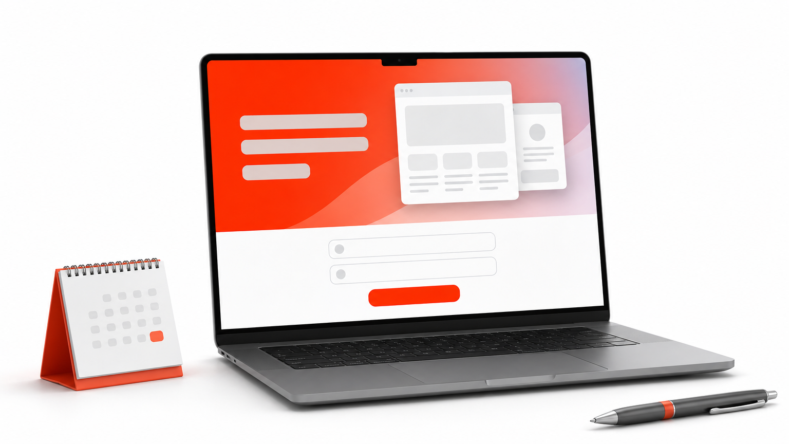
- A headline that names the result the attendee gets
- The date, time, and time zone directly under it
- Three bullets on what they will learn
- A button worded as an action, such as "Save my seat"
You can copy this skeleton and fill in the brackets:
Headline: How to [result] in [timeframe] without [common pain]
Subhead: Live webinar on [day, date] at [time and time zone], hosted by [name]
Bullets: Learn [outcome 1] / Avoid [mistake] / Get [takeaway]
Button: Save my seat
A registration page works when the visitor sees what they get, when it happens, and where to click, all without scrolling.
Who it suits
First-time hosts and cold traffic from ads or social media fit this layout best. Visitors give you a few seconds, and fewer form fields mean more sign-ups.
Skip it for expensive or complex topics. Someone weighing a premium offer wants more proof than a single screen gives.
How to build it in Divi
Put a hero section at the top and drop the Email Optin module into the right column, connected to your email provider. If your webinar platform gives you an embed form, paste it into a Code module instead.
Divi Hat’s Divi Hero Sections are built for Divi 5. The pack has 75+ heroes for $19.99 with unlimited website usage. They are general-purpose designs, so you swap in your own webinar headline, form, and image.
2. Speaker-led registration page
What the layout contains
A speaker-led webinar landing page puts the host’s face next to the headline. People register for someone they trust, so this layout builds credibility before it asks for an email address.
- A split hero with headline and form on one side and a headshot on the other
- A two-sentence bio built around results, not job titles
- Logos of publications or companies that have featured the speaker, only if they are real
- One line of proof, such as a result from a past event
People sign up for a speaker they trust, so show the speaker before you ask for the email.
Who it suits
Consultants, coaches, agencies, and freelancers selling a service get the most from it, because the webinar works as a first meeting. It also suits warm audiences, such as an existing email list or social following.
Pass on it when the topic is the draw and the host is unknown. A headshot with no proof behind it adds nothing.
How to build it in Divi
Use a two-column hero with an Image module for the headshot and a Person module for the name, role, and short bio. Add a row of small Image modules underneath for the logo strip.
For the hero itself, look through the same Divi Hat hero pack for a two-column design. Then replace the image with your headshot and set the colors to match your brand.
3. Agenda and takeaways page
What the layout contains
This is the longest webinar landing page template on the list. It answers what a skeptical visitor asks before giving up an hour: what will I learn, who is this for, and is it worth my time? The page runs top to bottom in a fixed order.
- Hero with the registration form
- Three to five takeaways, one sentence each
- A timed agenda, for example 15 minutes of teaching, 20 of demo, and 15 of Q&A
- A "who this is for" line
- An FAQ, then a second form at the bottom
A long page earns its length only when every block answers a doubt the visitor actually has.
Who it suits
B2B topics, higher-priced products, and longer buying cycles suit this layout, where the webinar is a step in the sales process. The extra blocks give a cold visitor the reasons to commit.
Avoid it for light, low-stakes topics. A long page buries a small ask.
How to build it in Divi
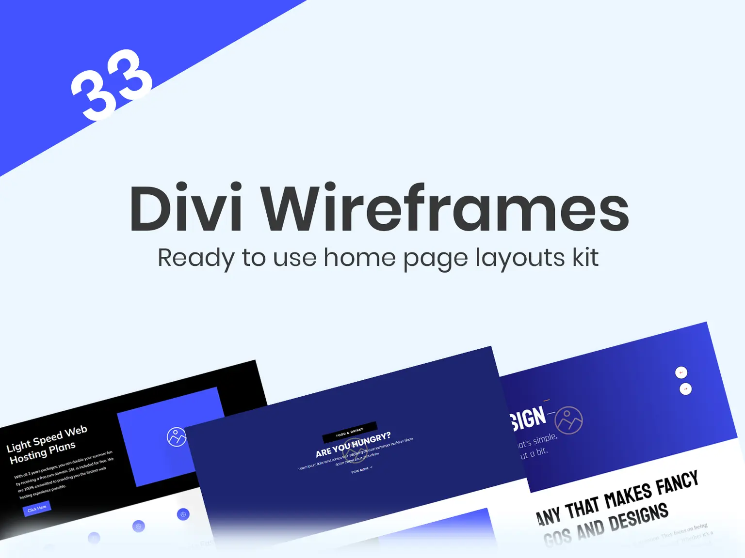
Plan the section order first. The Divi Wireframe Layouts Kit has 33 premade layouts for $29.99, which helps you structure the page before you write copy.
For the FAQ, the Divi Accordion Bundle includes 30+ Divi 5 accordion modules for $29.99. Good questions to answer there: is it free, how long is it, will there be a replay, and what does the form do with my email?
4. Countdown live-event page
What the layout contains
A countdown page adds time pressure to the single-goal layout. A timer sits under the headline, and the date and time zone are written out in plain text beside it. Use the same webinar landing page template structure, with the register button repeated mid-page and again at the bottom.
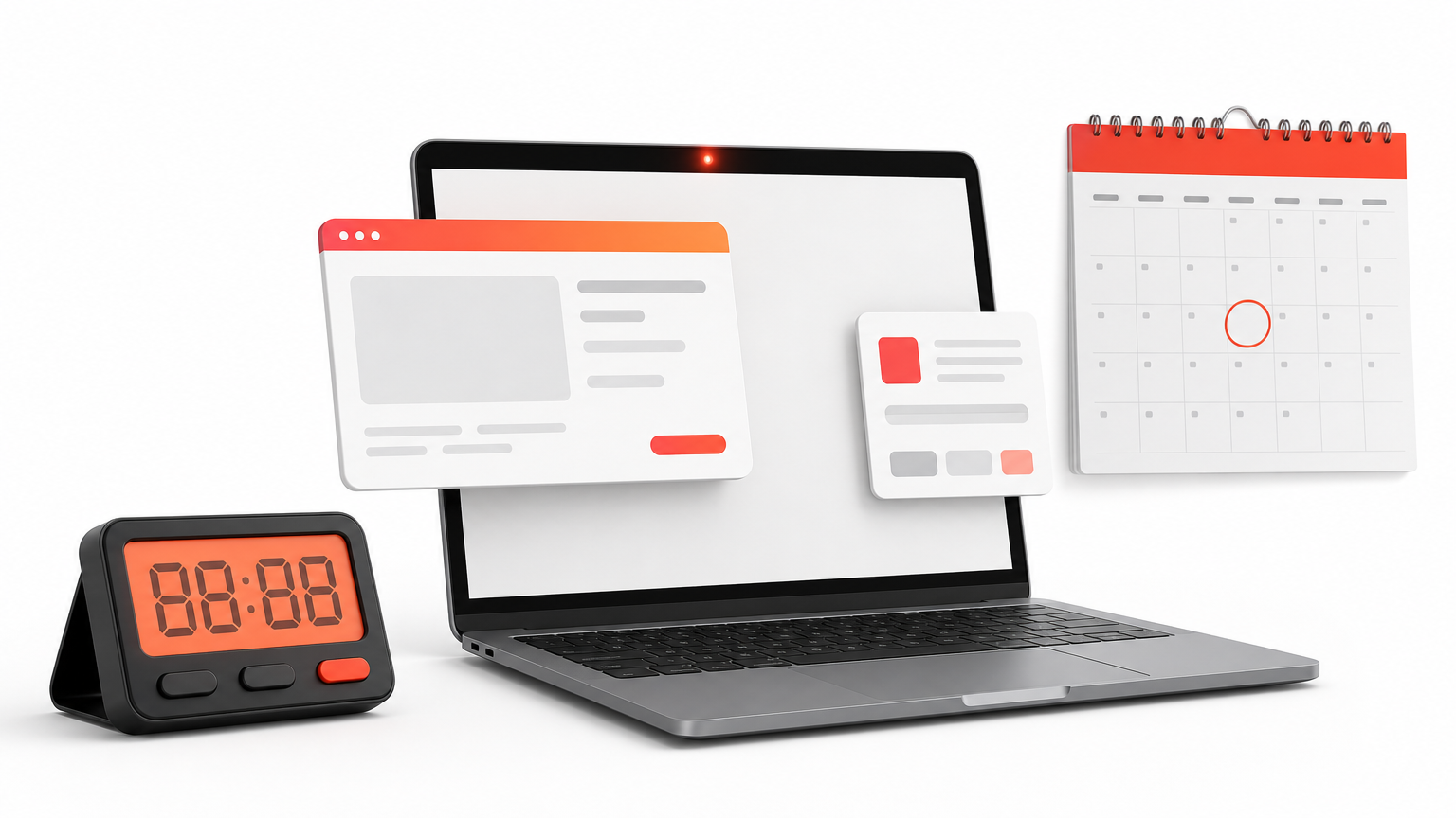
- Countdown timer to the start time
- Date and time zone in text, so nobody has to decode the timer
- A reminder line, such as "We’ll email you before we start"
- Limited-seat wording only if your platform really caps attendance
Urgency works only when it is true, so tie the timer to the real start time.
Who it suits
Fixed-date live events promoted by email, product launches, and live Q&As suit this layout. The timer gives your promotion emails a reason to say "register today."
Skip it for evergreen sessions. It also reads as slack when the date is more than a few weeks away.
How to build it in Divi
Divi has a Countdown Timer module. Set it to the start time and state the time zone in the text next to it. For the repeated buttons and banners, Divi CTA Layouts offers 58 pre-designed layouts at $39.99.
Here is a worked example. Hero Sections ($19.99) plus CTA Layouts ($39.99) come to $59.98. Add the $29.99 Accordion Bundle and the total reaches $89.97, which is more than the Standard Yearly Membership at $79.95 a year. The membership covers all products on unlimited sites.
5. Replay and on-demand page
What the layout contains
The replay page turns a finished session into an evergreen asset. It sells the recording the same way a live page sells the event, with a clear promise and one form. The video sits behind the form, so you still capture the lead.
- A cover image or short preview in place of a timer
- A "Watch now" button tied to a form
- Three to five key points or chapters from the session
- One next step at the bottom, such as a booking link or offer
A replay page keeps a webinar earning leads long after the live date has passed.
Who it suits
Evergreen funnels, people who missed the live session, and content libraries all fit this template. It also works for follow-up emails to no-shows.
Do not use it when the live Q&A was the real value. A recording of an interactive session rarely satisfies.
How to build it in Divi
Duplicate your registration page, then change the headline and button text. Point the form to an unlisted page that holds the video in a Video module, so only registrants reach it.
If you would rather hand the build off, Divi Hat’s Divi Web Design Landing Page service costs $199. It covers one custom page built with Divi, a slider with three slides, and up to five sections.
Pick one layout and publish it
The best webinar landing page template matches how well your audience already knows you. Cold visitors need the single-goal page or the agenda page. Warm lists respond to the speaker-led page. Fixed dates call for a countdown, and recordings belong on a replay page.
Whichever you choose, keep one goal, show the date with its time zone, and keep the form short. Build the page once, then duplicate it for the next event and change only the headline, date, and speaker.
If you build with Divi, the Divi Hat membership gives you every hero, CTA, wireframe, and accordion layout mentioned here for $79.95 a year, backed by a 30-day money-back guarantee.