
Every website you love using shares one thing in common: a web page layout that guides your eyes without you noticing it. Get the structure wrong and visitors bounce in seconds, no matter how good your content or copy is. Get it right and people find what they need, trust what they see, and stick around long enough to convert.
If you’re staring at a blank page trying to decide how to arrange your header, content blocks, and calls to action, you don’t need another design theory lecture. You need real examples of layouts that work, paired with a clear sense of when to use each one. That’s what this list delivers, no fluff, no guesswork.
Below you’ll find nine proven layout types, from classic F-patterns to card-based grids and full-screen hero designs, each with practical use cases and visual examples to study. Since these layouts translate directly into Divi, we’ll point out where you can grab pre-built sections and layout packs from our library instead of building from scratch, so you can move straight from inspiration to a finished page.
1. Grid layout
What it is
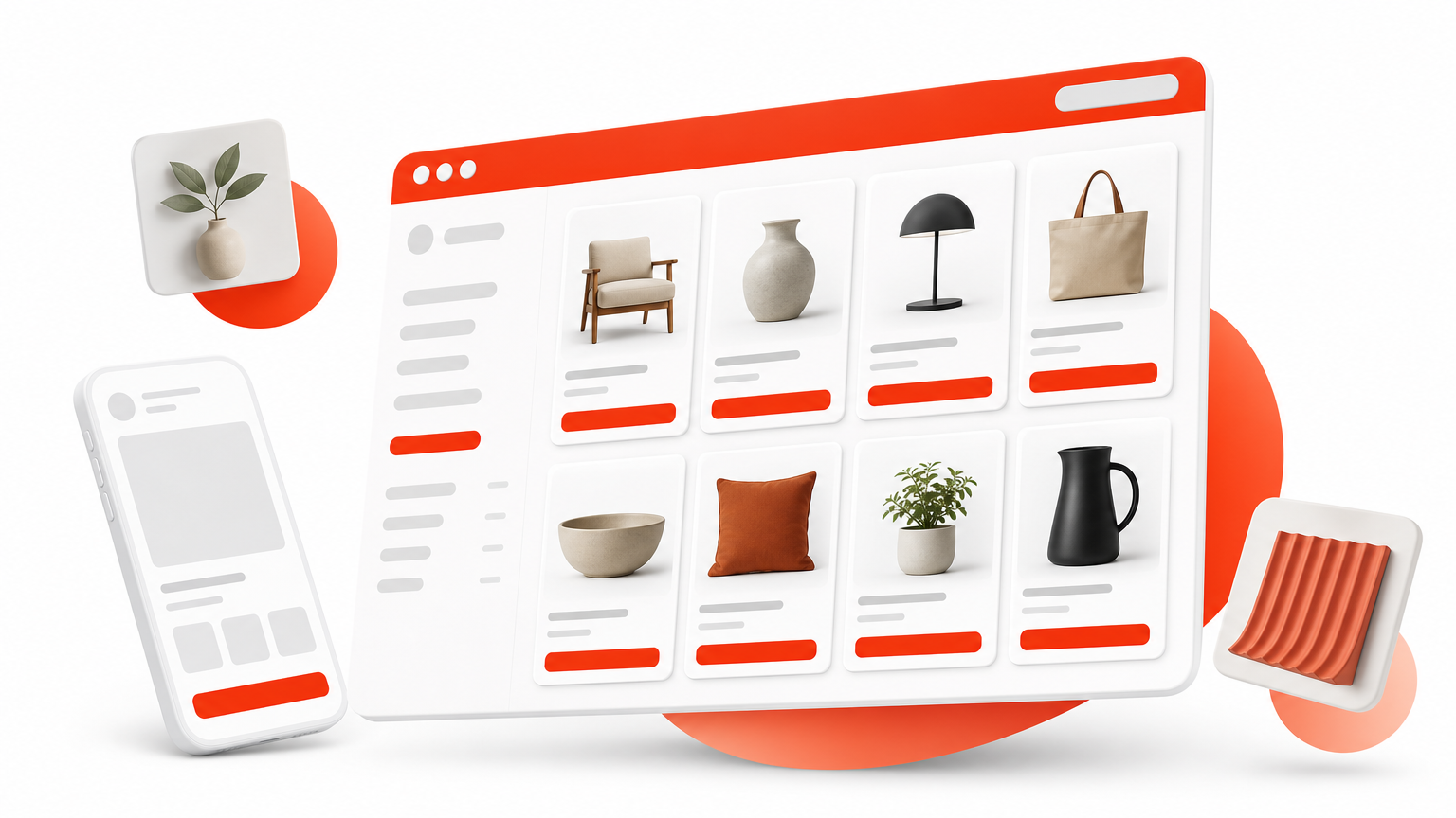
A grid layout arranges content into evenly spaced rows and columns, creating a modular structure that feels organized no matter how much content you’re dealing with. Think of it as an invisible skeleton of boxes, each holding an image, a headline, or a chunk of text, all lined up with consistent gutters and margins. This is one of the oldest and most reliable website layout designs because it mirrors how print designers laid out newspapers and magazines long before the web existed.
Best for
Grids shine when you have many similar items to display side by side. Portfolios, product catalogs, photography sites, and blog archives all benefit from this structure because it lets visitors scan and compare options quickly. E-commerce stores rely on grids constantly, since shoppers expect to browse products in neat rows rather than a single winding column. If your site’s main job is showing off a collection of anything, a grid probably belongs in your toolkit.
A grid layout works because it turns visual comparison into a habit your visitors already have.
Example in action
Picture an online shop’s category page: four or six product cards per row, each with a photo, price, and quick-add button, repeating down the page in a clean pattern. E-commerce giants like Amazon use this exact approach on their search results pages, packing dozens of products into a scannable grid without overwhelming the shopper. On a Divi site, you can recreate this instantly using one of our grid-based Divi layout packs, many of which already include product and portfolio sections ready to customize.
Design tips
Consistency is what makes a grid feel intentional rather than accidental. Keep these points in mind when you build one:
- Match card dimensions. Uneven image sizes break the visual rhythm and make the grid look sloppy.
- Limit columns on mobile. Drop from four or six columns down to one or two on smaller screens so text and images stay readable.
- Use generous white space. Tight gutters make a grid feel cramped; give each item room to breathe.
- Highlight one item sparingly. A single larger card can break monotony, but overdoing it defeats the grid’s purpose.
Stick to these basics and your grid will guide attention instead of scattering it.
2. Single-column layout
What it is
A single-column layout stacks every element, images, text, buttons, straight down the middle of the page in one linear path. There’s no competing sidebar or split content to distract the eye, just one clear direction: down. This simplicity makes it one of the most forgiving web page layout choices for anyone who isn’t a trained designer, since there’s no grid math or alignment puzzle to solve.
Best for
Blogs, landing pages, and mobile-first sites lean on single-column structures because reading naturally flows top to bottom. Storytelling brands and personal portfolios also favor it, since it forces visitors to absorb content in the exact order you intended rather than jumping around. If your goal is guiding someone step by step toward one action, like signing up or reading an entire article, this layout removes every distraction that could pull them off course.
A single column works because it never gives your visitor a reason to look anywhere but forward.
Example in action
Apple’s product pages are the textbook case: one scrolling story, section after section, each building on the last until you hit the buy button. On Divi, our single-column landing page designs are ready-made, so you can drop content into them without touching the structure.
Design tips
Spacing carries more weight here than in any other layout. Follow these rules:
- Vary section backgrounds to signal where one idea ends and the next begins.
- Keep line length readable, around 60-75 characters per line.
- Add breathing room between sections so scrolling never feels relentless.
Think rhythm, not just order.
3. Split-screen layout
What it is
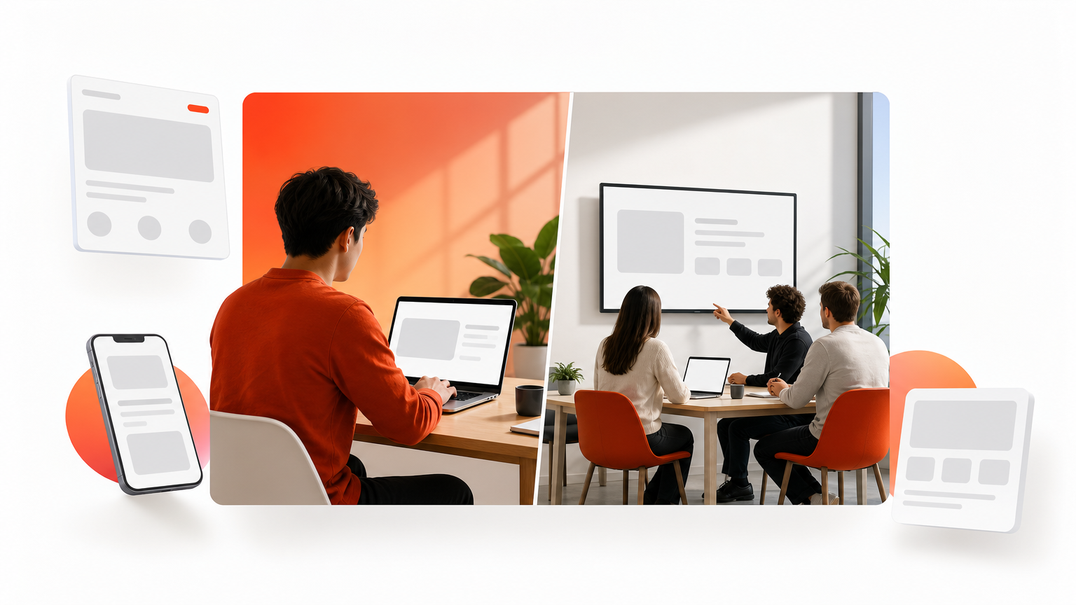
A split-screen layout divides the page into two equal (or near-equal) halves, usually left and right, each carrying its own image, message, or action. Instead of one path down the page, you give visitors two parallel stories at once, often used to present a choice or a contrast right at the top of a web page layout. It’s a bold structural move that works because it forces a decision the moment someone lands.
Best for
This layout suits sites with two distinct audiences or offers, think software with separate paths for individual users versus teams, or a fashion brand showing menswear on one side and womenswear on the other. Agencies pitching two service tiers, or apps needing a signup versus login choice, also lean on split screens because the format does the sorting for you before a visitor scrolls an inch.
A split screen works because it turns a decision into the first thing your visitor sees, not the tenth.
Example in action
Slack’s homepage has used split-screen sections to separate messaging features from platform integrations, letting each half breathe with its own visual and headline. On Divi builds, you can achieve the same effect fast using our split-screen hero layouts, several of which come with image and text panels already positioned side by side.
Design tips
Balance matters more here than anywhere else. Keep these in mind:
- Match visual weight on both sides so neither half feels like an afterthought.
- Stack vertically on mobile, since two narrow columns squeeze text unreadable.
- Use contrasting colors between halves to reinforce the divide.
Getting the split even keeps both messages competing fairly for attention.
4. Asymmetrical layout
What it is
An asymmetrical layout breaks away from even columns and matching grids on purpose, placing elements off-center or in mismatched sizes to create visual tension. Rather than mirroring one side against the other, you let a large image sit next to a small text block, or push a headline into open space instead of centering it. This unbalanced structure is one of the more advanced web page layout choices because it takes a trained eye to keep it feeling deliberate rather than messy.
Best for
Creative portfolios, design studios, and fashion or art brands reach for asymmetry when they want to signal originality before a visitor reads a single word. It also suits editorial sites and campaign pages that need to stand out from the sea of predictable, boxed-in templates competitors use. If your brand identity is built on being different, this layout backs that claim up visually.
Asymmetry works because it signals a brand confident enough to break the grid on purpose.
Example in action
Design agency sites often overlap a photo with a text box, letting the copy bleed slightly onto the image edge for depth. Our creative portfolio themes for Divi include several designs with this exact overlapping, off-grid structure, so you get the creative effect without hand-coding custom positioning.
Design tips
Balance still exists in asymmetry, it’s just distributed unevenly. Follow these:
- Anchor with negative space so the page doesn’t feel cluttered.
- Limit asymmetry to one or two sections, not the whole page.
- Test on mobile early, since off-grid elements often need a completely different stacked order.
5. Full-screen layout
What it is
A full-screen layout uses the entire browser viewport for a single image, video, or message before any scrolling happens, turning the first impression into a cinematic moment. Nothing competes for attention here, no navigation clutter, no sidebar, just one bold visual statement that fills the screen edge to edge. This approach to web page layout design has become a signature move for brands that want their homepage to feel like an event rather than a menu of links.
Best for
Hospitality brands, film studios, photographers, and luxury products all reach for full-screen openings because the format sells emotion before it sells features. Startups launching a single flagship product also use it to create drama around one hero shot, and event or conference sites use it to make a date and location impossible to miss. If your goal is impact over information density, this layout delivers it immediately.
A full-screen opening works because it makes your visitor feel something before they read a single word.
Example in action
Airbnb has used full-bleed destination photography behind its search bar to sell a feeling before a booking form. Our hero section sliders include dozens of full-screen ready templates with background video and image support, so you can drop in your own photography without touching CSS.
Design tips
Compress images heavily since full-screen assets are the biggest files on any page. Test load times on mobile data, not just Wi-Fi, and always add a scroll cue so visitors know more content sits below the fold.
6. Card-based layout
What it is
A card-based layout breaks content into small, self-contained boxes, each holding an image, headline, and short description, like digital index cards spread across the page. Every card acts as its own mini-unit, so visitors can scan, click, or skip without needing to process the whole page at once. This modular approach to web page layout design has taken over dashboards, news feeds, and app interfaces because it scales cleanly whether you have five items or five hundred.
Best for
Blogs with mixed content, membership dashboards, and app-style interfaces all rely on cards because they organize unrelated pieces of information without forcing a rigid order. Real estate listings, recipe sites, and course platforms use cards constantly, since each property, dish, or lesson deserves its own contained preview. If your content naturally splits into distinct, comparable chunks, cards give visitors an easy way to browse without commitment.
Cards work because they let visitors sample many ideas before committing to one.
Example in action
Pinterest built its entire interface around cards, letting users skim hundreds of images in a scrollable feed. Divi’s pre-built layouts include ready-made card grids for blogs, card-style portfolio designs, and pricing tables, so you can populate the structure with your own content in minutes.
Design tips
Keep card content brief, one image, one headline, one short line of text, so the eye doesn’t linger too long on any single box. Add subtle hover effects like a shadow lift to signal interactivity, and always leave equal spacing between cards so the grid reads as unified rather than scattered.
7. Magazine layout
What it is
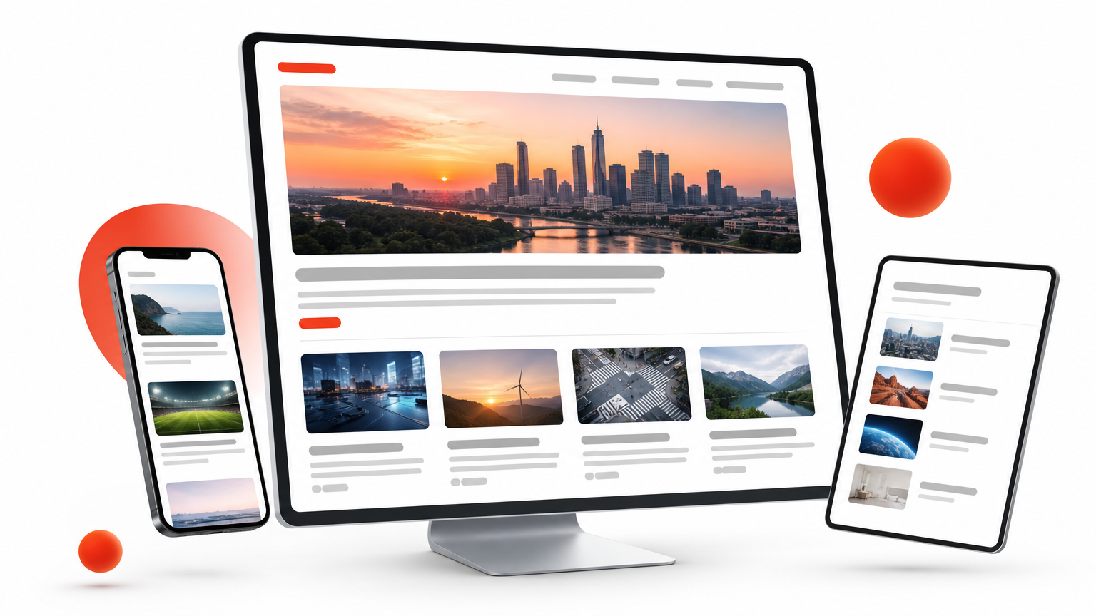
A magazine layout borrows its structure straight from print publications, mixing multiple columns, varied text sizes, and irregular image placements on a single page. Unlike a grid, where every box matches its neighbor, a magazine layout deliberately breaks that uniformity with a large feature image up top, smaller thumbnails below, and pull quotes or captions weaving through the copy. This web page layout style thrives on visual hierarchy, guiding the eye from a dominant headline down through secondary stories.
Best for
News sites, online publications, and content-heavy blogs reach for magazine layouts because they need to showcase dozens of stories on one page without making it feel like a wall of links. Multi-author sites and niche publications also lean on this format to highlight a lead story while still surfacing older or related posts. If your homepage doubles as a content hub rather than a single sales pitch, this layout earns its complexity.
A magazine layout works because it lets one big story lead while dozens of smaller ones stay within reach.
Example in action
The New York Times homepage is the classic reference: one dominant headline and photo up top, followed by a dense mix of smaller stories organized by section. Our blog and news-style Divi templates use this same mixed-column structure, so you can populate featured posts and archives without hand-coding a custom grid.
Design tips
Establish a clear hierarchy first, decide which story or product gets the biggest treatment before filling in the rest. Use consistent typography styles across sections so the variety in sizing still feels like one cohesive page, and test column counts on tablet screens, since magazine layouts often break awkwardly at mid-size widths before they simplify to single columns on phones.
8. Z-pattern layout
What it is
A Z-pattern layout guides the eye along the shape of the letter Z: starting top-left, sweeping right across the header, cutting diagonally down to the left, then finishing with another sweep right toward the call to action. This page layout design works because it mirrors how eyes naturally scan simple, text-light pages rather than fighting that habit with a rigid grid.
Best for
Landing pages, sparse marketing pages, and any screen with one clear goal suit the Z-pattern best. Software signup pages, single-offer promotions, and simple portfolio homepages all benefit because there’s little content competing for attention, just a logo, a headline, an image, and one button placed exactly where the eye lands last.
A Z-pattern works because it puts your call to action exactly where the eye stops looking.
Example in action
Many SaaS homepages open with a logo top-left, a nav menu top-right, a headline and subtext angled toward a hero image, then a signup button bottom-right, tracing the Z without the visitor noticing the design behind it, the same flow you’ll spot in the best landing page templates for high-converting sites. Our pre-built Divi layouts include landing page templates built on this exact flow, so the header, hero, and button placement are already positioned along the pattern.
Design tips
Place your logo top-left and your primary button bottom-right since those are the two anchor points readers land on first and last. Keep the middle diagonal light, one image or one line of supporting text is plenty, and avoid adding a second competing call-to-action section anywhere along the path.
9. Fixed sidebar layout
What it is
A fixed sidebar layout locks a navigation panel or menu in place on one side of the screen while the main content scrolls independently past it. Unlike a header that disappears as you scroll down, this website layout keeps key links, filters, or branding permanently visible, so visitors never lose their place in a longer site. It’s less about first impressions and more about sustained navigation across many pages.
Best for
Documentation sites, dashboards, and knowledge bases rely on fixed sidebars because users need constant access to categories or settings while reading deep content. E-commerce filter panels and admin tools also favor this structure, since shoppers or site managers adjust options repeatedly without wanting to scroll back up each time. Anywhere navigation needs to stay within reach, a sidebar earns its keep.
A fixed sidebar works because it keeps the map open while your visitor explores the territory.
Example in action
Stripe’s developer documentation pins its navigation tree on the left while API details scroll on the right, letting engineers jump between topics instantly. Divi handles this with sticky module settings, and our child themes include sidebar-ready templates for blogs and resource hubs that need this exact persistent-navigation structure without custom scripting.
Design tips
Collapse the sidebar into a hidden menu on mobile screens, since fixed panels eat too much horizontal space on phones. Cap sidebar width around 250-300 pixels so main content still has room to breathe, and test scroll behavior carefully, a sidebar that jitters or overlaps content undermines the entire point of keeping it fixed.
Finding the right layout for your website
None of these nine layouts is inherently better than the rest. A grid layout sells products, a full-screen layout sells emotion, and a fixed sidebar keeps documentation navigable. The right choice depends on what your visitor needs to do on that specific page, not which style looks trendiest this year. Look at your content first: how much of it there is, how it splits into chunks, and what single action you want someone to take before deciding on structure.
Once you’ve settled on a direction, building it shouldn’t take weeks. Every web page layout covered here already exists as a ready-made Divi section in our library, tested, mobile-responsive, and built for drag-and-drop customization. Skip the blank canvas and grab the structure that matches your goal. Join the Divi Hat layout membership and start assembling pages that actually convert today.