Turn a flat spreadsheet into a chart your visitors actually want to look at — without leaving the Divi Visual Builder.

If you've ever pasted a screenshot of a spreadsheet into a WordPress page and hoped it would "look professional enough," Divi 5's new Chart module was built to end that habit for good. It's a native module — no third-party plugin required — that turns a simple table of numbers into a live, interactive chart directly inside the Visual Builder.
Below, we answer the questions Divi users are actually asking about this new module: what it is, which chart types it supports, how the data table works, how to import a CSV, and how to style the result so it matches your brand.
What Is the Divi 5 Charts Module?
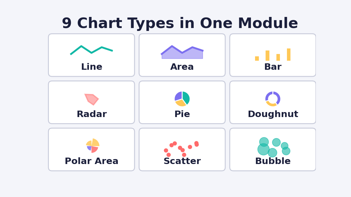
Short answer: The Chart module is a built-in Divi 5 module that reads a spreadsheet-style data table and renders it as an interactive chart — line, bar, pie, and six other formats — with no code and no external plugin.
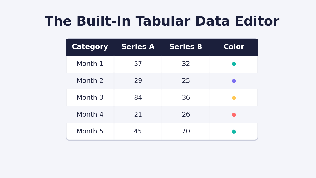
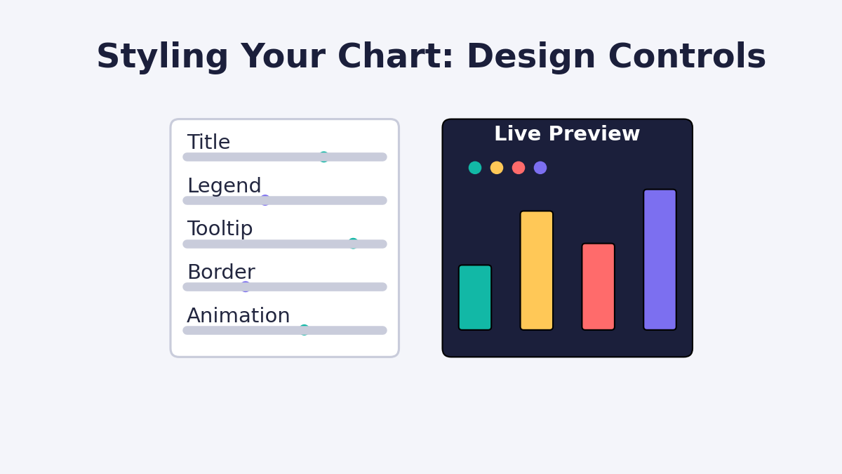
You type labels and values into a table, choose a chart type, and Divi draws it on the page in real time. Because the chart lives inside the Visual Builder, every element — the title, legend, tooltip, colors, borders, and animation — is styled using the same design controls you already use on other Divi modules.
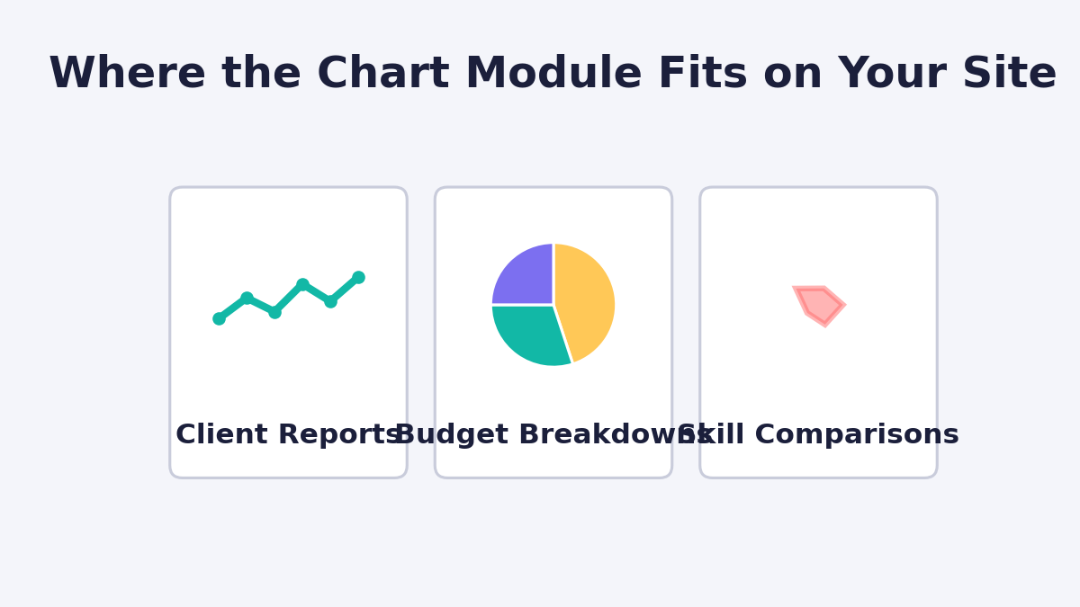
This matters for anyone who publishes data on a website: agencies building client reports, bloggers presenting survey results, SaaS teams showing product metrics, or eCommerce sites comparing plans. Instead of embedding a static image or relying on a heavier charting plugin, the data and the design now live in the same place.
What Chart Types Can You Create With the Divi 5 Charts Module?
Short answer: Nine. Line, Area, Bar, Radar, Pie, Doughnut, Polar Area, Scatter, and Bubble — and you can switch between them without re-entering your data.