
How Does Divi 5’s Chart Module Work?

by Shahzad Raza | Sep 7, 2026

Ready to Build With Divi 5?

A Divi license is required to use our products.

Turn a flat spreadsheet into a chart your visitors actually want to look at — without leaving the Divi Visual Builder.

Divi Charts Module

If you've ever pasted a screenshot of a spreadsheet into a WordPress page and hoped it would "look professional enough," Divi 5's new Chart module was built to end that habit for good. It's a native module — no third-party plugin required — that turns a simple table of numbers into a live, interactive chart directly inside the Visual Builder.

Below, we answer the questions Divi users are actually asking about this new module: what it is, which chart types it supports, how the data table works, how to import a CSV, and how to style the result so it matches your brand.

What Is the Divi 5 Charts Module?

Short answer: The Chart module is a built-in Divi 5 module that reads a spreadsheet-style data table and renders it as an interactive chart — line, bar, pie, and six other formats — with no code and no external plugin.

You type labels and values into a table, choose a chart type, and Divi draws it on the page in real time. Because the chart lives inside the Visual Builder, every element — the title, legend, tooltip, colors, borders, and animation — is styled using the same design controls you already use on other Divi modules.

This matters for anyone who publishes data on a website: agencies building client reports, bloggers presenting survey results, SaaS teams showing product metrics, or eCommerce sites comparing plans. Instead of embedding a static image or relying on a heavier charting plugin, the data and the design now live in the same place.

What Chart Types Can You Create With the Divi 5 Charts Module?

Short answer: Nine. Line, Area, Bar, Radar, Pie, Doughnut, Polar Area, Scatter, and Bubble — and you can switch between them without re-entering your data.
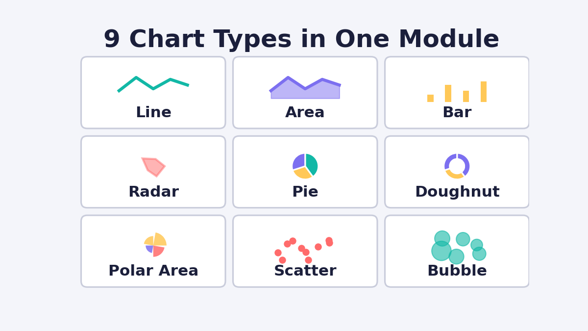
Divi 5 Chart Module

Here's how each type is best used, and how it reads your data table:

Chart Type Best For How It Reads Your Table
Line Trends over time (traffic, revenue) Column 1 = category labels; every column after = a series
Area Trends with visual weight/volume Same as Line
Bar Comparing values across categories Same as Line
Radar Scoring several items across shared categories Same as Line
Pie Showing how one total splits up Column 1 = labels, Column 2 = values
Doughnut Same as Pie, with a hollow center Column 1 = labels, Column 2 = values
Polar Area Comparing magnitude and category together Column 1 = labels, Column 2 = values
Scatter Showing the relationship between two variables Column 2 = X axis, Column 3 = Y axis
Bubble Same as Scatter, plus a third variable as size Column 2 = X, Column 3 = Y, Column 4 = Size

Because the underlying data table stays the same when you switch chart types, you can experiment — start with a Bar chart, try it as a Radar chart, and land on whichever tells the story best — without retyping a single number.

How Do You Add the Chart Module to a Divi Page?

Short answer: Open the Visual Builder, add a Row, click the module icon, and search for "Chart" — the module comes pre-loaded with sample data so you see a working chart immediately.

  1. Load the Visual Builder on the page where the chart should appear.
  2. Click the green plus icon to insert a Row.
  3. Click the gray plus icon inside that Row to open the module list.
  4. Search for Chart and select it.

The module settings panel opens automatically, organized into three tabs: Content (data and text), Design (visual styling), and Advanced (custom CSS, HTML tag, conditions, and interactions).

How Does the Tabular Data Editor Work?

Short answer: All of your chart's data lives in one spreadsheet-style table inside the Content tab. You can add or remove rows and columns, drag to reorder, hide a column without deleting it, and set colors directly on the table — no separate settings panel needed.

Divi Tabular Data

A small label above each column header tells you exactly how that column is currently being used — Category, Series, Value, X axis, Y axis, Size, or Not Used — so there's never any guessing about what will actually render on the chart.

Colors are also set inside this table rather than in the Design tab: click the color swatch on a column (for Line, Area, Bar, and Radar charts) or on a row (for Pie, Doughnut, Polar Area, Scatter, and Bubble charts) to change it. If you leave a color unset, Divi assigns one automatically, and your custom colors carry over even if you later switch to a chart type that reads color the opposite way.

Can You Import Chart Data From a CSV File?

Short answer: Yes. Click "Import CSV" in the Content tab to populate the entire data table from a spreadsheet export in one step, instead of typing every value by hand.

Divi Charts

This is the fastest way to get real numbers — Google Analytics exports, sales reports, survey results — onto the page. One thing to plan for: WordPress blocks CSV uploads by default for security reasons, so if the import button doesn't accept your file right away, your host or site admin will need to allow that file type before it will work.

What Design and Styling Options Does the Chart Module Include?

Short answer: Every visible part of the chart — title, subtitle, legend, tooltip, borders, shadows, filters, and entrance animation — has its own dedicated styling controls in the Design tab, the same way any other Divi module works.

Divi Design Control

Specifically, you can control:

  • Title & Subtitle Text — font, weight, color, size, and line height
  • Legend — position (top, left, bottom, right, or inside the chart area), alignment, and marker shape (box, circle, cross, star, or triangle)
  • Tooltip — background color, border, corner radius, padding, and whether a small color swatch appears next to the value
  • Sizing, Spacing, Border, Box Shadow, Filters, Transform, and Animation — the standard Divi design groups, applied to the whole module

A useful detail for anyone fine-tuning the look: opening the Tooltip settings shows a live tooltip preview on the chart as you style it, so you don't need to keep hovering over the module to check your changes.

For deeper customization, the Advanced tab includes a Chart Canvas CSS field that targets the chart area specifically, plus the usual CSS ID/class, custom HTML tag, conditions, and interaction options available on every Divi 5 module.

What Are the Best Use Cases for the Divi Chart Module?

Short answer: Reporting results over time, breaking down a total into parts, and comparing multiple items across shared categories — the three jobs charts do best on any website.

Divi Charts Module

  • Reporting results — Show revenue, traffic, or sign-ups over time using a Line or Bar chart on a client report or "About" page.
  • Breaking down a total — Use a Pie or Doughnut chart to show how a budget, market share, or survey result splits up.
  • Comparing several things at once — Use a Radar chart to score products, pricing plans, or team skills across the same set of categories.

Frequently Asked Questions

Do I need a third-party plugin to use the Divi 5 Chart module? No. It's a native Divi 5 module — the data table, chart rendering, and styling controls are all built in.

Can I switch chart types after I've entered my data? Yes. Your data stays in one table, and Divi re-reads the same columns differently depending on the chart type you select, so you never have to retype your numbers.

How many chart types does Divi 5 support? Nine: Line, Area, Bar, Radar, Pie, Doughnut, Polar Area, Scatter, and Bubble.

Can I upload a CSV instead of typing data manually? Yes, using the Import CSV button in the Content tab. If WordPress blocks the upload, your host needs to allow CSV file uploads first.

Summary

Divi 5's Chart module replaces static screenshots and third-party chart plugins with a native, no-code way to turn tabular data into nine types of interactive, on-brand charts. Data lives in a single spreadsheet-style table that adapts to whatever chart type you choose, CSV import speeds up populating real numbers, and a full set of Design-tab controls means the chart can be styled to match the rest of the site — right down to the tooltip. For anyone publishing reports, comparisons, or breakdowns on a WordPress site, it turns a routine task into something visitors will actually stop and read.

Ready to Build With Divi 5?

A Divi license is required to use our products.

Learn more on this topic

Related Blog Posts

Which Is Best, Elementor or Divi?

Which Is Best, Elementor or Divi? Short Summary Divi 5 is a better choice than Elementor for many WordPress users who want a powerful visual builder, flexible website design system, reusable layouts, and an efficient workflow. While Elementor is an excellent WordPress...

How to add Divi 5 Instagram Module?

Short Summary The Divi 5 Instagram Module makes it easier to bring your latest Instagram content directly into a WordPress website without treating the feed like a basic third-party embed. You can connect an Instagram account, choose how many posts to display, control...

How to Make Custom Section Dividers in Divi

How to Make Custom Section Dividers in Divi Want to make your Divi website look more modern and visually engaging? Custom section dividers in Divi are one of the easiest ways to create smooth transitions between sections without relying on images or complicated design...

5K+ Divi Users Can’t Be Wrong 

Become a Member Today!

Get more than 100+ premium Divi layouts, hero sections, Wireframes and child themes. For freelancers, agencies, & business owners.

Welcome Gift For You

Get Instant Access To All
Free Divi Layouts