
Most visitors who reach the bottom of a page are still looking for something. Maybe it is a contact link, a return policy, or the next step after your content. A weak footer sends them away. Good footer design for website projects turns that last scroll into a useful destination.
Here is the short answer. An effective footer is organized into 3 to 5 clear columns, repeats your key navigation, and shows contact details, legal links, and one clear call to action. Keep it simple and easy to scan on mobile. Skip anything that does not help a visitor decide or find something fast.
Below you will find 7 website footer design examples and the layout patterns behind each one. You will also get best practices for what to include and what to cut. At Divihat, we build Divi layouts and child themes for freelancers and agencies, so we pay close attention to footers that are easy to customize and reuse. Each example comes with notes you can apply to your next Divi footer build or any other platform.
1. Divi footer layouts from Divihat
What the footer includes
Divihat sells complete Divi kits, so the footer arrives already matched to the rest of the design. The 8 Divi child themes for business websites and 26+ pre-built layouts share fonts, colors, and spacing from header to footer. That consistency is hard to get when you assemble a footer from scratch. A typical footer in these kits covers:
- Logo and a one-line brand statement
- Three or four link columns for services, company, and resources
- Contact details and social icons
- Copyright line and legal links
A footer that already matches your header and hero saves more build time than any standalone footer template.
Best use case
Freelancers and agencies get the most from this option. Divihat’s membership includes unlimited website usage, client projects included, and the images are royalty-free. You can reuse one footer structure across ten client sites without tracking licenses.
It also works well for header and footer website design pitches. Pair a footer with one of the 75+ Divi 5 hero section designs, and you can show a client a full page, top to bottom, in a single demo. Business owners who build their own Divi sites benefit too, since the drag-and-drop Divi Builder modules need no code.
Customization and tips
Build the footer once in the Divi Theme Builder so it applies to every page. Then adapt it to the client:
- Open Divi > Theme Builder and add a global footer.
- Import the footer layout from your kit.
- Swap in the client’s logo, link columns, and contact details.
- Match button and link colors to the brand palette.
- Check the stacked mobile view before you show anything.
Cut the columns that do not apply. A small service business rarely needs four columns, and three focused columns usually read better than four thin ones. Keep the legal links (privacy policy and terms) in the bottom bar so they stay out of the way but easy to find. If you want to test a layout first, Divihat backs its library with a 30-day money-back guarantee, which lowers the risk of trying it on a real project.
2. Multi-column sitemap footer
What the footer includes
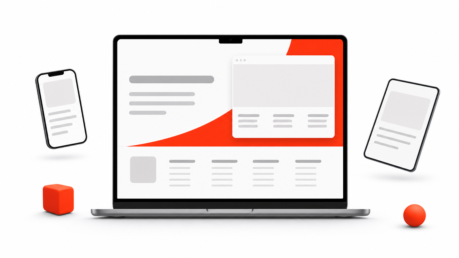
The multi-column sitemap footer works like a compact site map at the bottom of every page. It groups links under short headings, so visitors can jump to any major section without scrolling back to the menu. Most versions include:
- 3 to 5 columns with headings such as Services, Company, and Resources
- 5 to 7 links per column, pointing to your most important pages
- A logo or contact block in the first or last column
- A bottom bar with copyright and legal links
A sitemap footer is a second navigation menu, so build it around the pages people actually look for.
Best use case
This layout suits content-heavy sites such as agencies, SaaS products, and blogs with dozens of pages. It also adds internal links to deep pages on every URL, which helps visitors and crawlers find them. Among website footer design examples, it is the most common for a good reason. Small brochure sites with five pages rarely need it.
Customization and tips
Keep each column to seven links or fewer, and order them by importance, not alphabetically. Give column headings a heavier font weight than the links, and leave about 12 to 16 px between links so they are easy to tap.
On mobile, stack the columns or collapse them into Divi accordion layouts. A good website footer UI design never turns into a wall of tiny links. Check text contrast too, especially muted gray links on dark backgrounds, because footers are where low-contrast text tends to hide.
3. Minimal single-row footer
What the footer includes
The minimal footer puts everything on one horizontal line. It is the leanest take on footer design for website projects, and it usually stands only 60 to 80 px tall. A typical row holds:
- Copyright text on the left
- Three to five links in the center, such as Privacy, Terms, and Contact
- Social icons or a single email link on the right
When a page has one job, the footer should not compete with it.
Best use case
Portfolios, landing pages, and single-purpose sites get the most from this layout. Visitors on those pages should focus on one action, and a heavy footer pulls their attention away. Personal brands and small studios with fewer than ten pages also fit well. Of all the website footer design ideas here, this is the cheapest to build and maintain.
Customization and tips
Keep the row to five links or fewer, and put the most useful one, usually Contact, closest to the right edge where the eye lands last. Use a subtle top border or a slightly different background shade so the footer reads as a separate zone.
Below 768 px, stack the three groups vertically and center them. Give each link a tap target of at least 44 px, since a single row of tiny links is hard to hit on a phone. If you need more than five links, switch to the multi-column layout above instead of cramming them in.
4. Ecommerce footer with trust signals
What the footer includes

Footer design for ecommerce website projects has a different job than a brochure site, much like the different web page layout types serve different goals. It must reassure shoppers before they enter a card number. Most store footers include:
- Shipping, returns, and order tracking links
- Payment icons such as Visa, Mastercard, PayPal, and Apple Pay
- Security badges and a phone or live chat link
- Shop categories and a short About link
Shoppers scan the footer to decide whether your store is safe to buy from.
Best use case
Online stores that sell to first-time buyers need this layout most. Unknown brands gain the most, because a visible return policy and familiar payment logos ease doubt at checkout.
It also fits stores with long catalogs. Category links in the footer give shoppers a second path into your products when the main menu feels crowded.
Customization and tips
Show only what is true. A fake badge costs you more trust than no badge. Then tighten the layout:
- Keep payment icons small, about 32 to 40 px wide, in one tidy row.
- Put returns and shipping in the first column, where people look first.
- Add your support hours next to the contact link.
- On mobile, collapse category links into accordions and leave the trust row visible.
If your platform allows it, link the footer’s help items to a single support page so you update policies in one place.
5. Footer with newsletter signup and CTA
What the footer includes
This footer gives the last scroll a clear job: collect an email address or push one next step. The signup block usually fills a full-width band above the link columns. Expect:
- A short headline and one line of benefit copy
- An email field and a single button
- A secondary CTA, such as Book a call or Start free trial
- Standard link columns and legal links below the band
A footer signup form works when it offers something specific, not just "stay updated."
Best use case
Blogs, SaaS products, and course sellers get the most from this layout. Their visitors often finish an article without being ready to buy, so a footer form catches them at the moment they are done reading.
Lead magnets raise sign-ups further. At Divihat, we offer free Divi layout freebies as opt-ins, and a concrete freebie beats a generic newsletter pitch every time.
Customization and tips
Ask for the email address only, because every extra field lowers completions. In Divi, the Email Optin module connects to services like Mailchimp and ConvertKit, so you can build the form without code. Then tune the details:
- Write button text that names the result, such as "Send me the layout."
- Add a short privacy note that links to your policy.
- Use a contrasting button color so the CTA stands apart from the link columns, the same way the best Divi CTA section designs do.
- On mobile, make the field and button full width.
6. Footer with contact info and map
What the footer includes
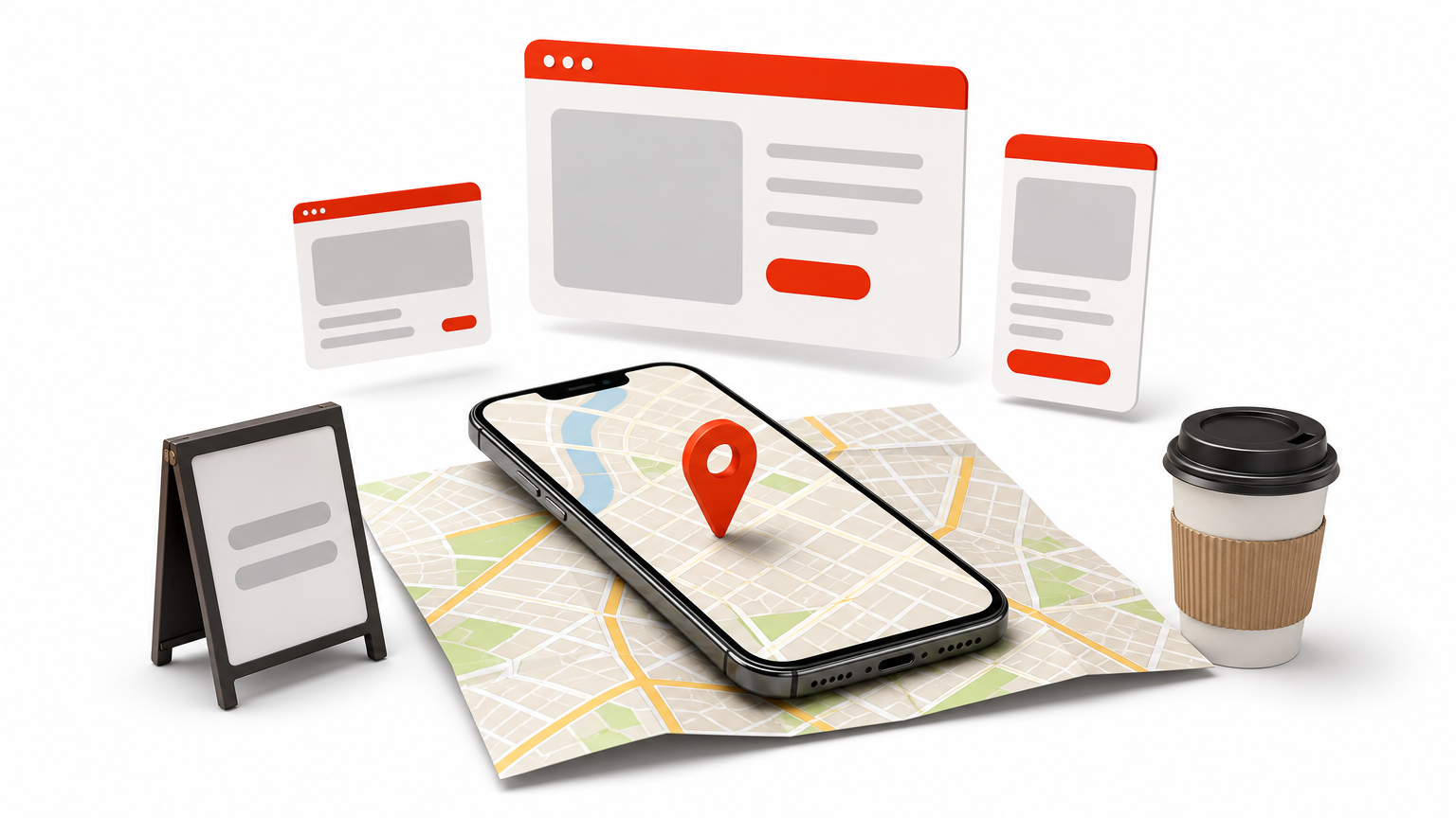
This footer puts location and contact details front and center, so visitors never hunt for an address or phone number. The map usually sits beside a short contact column, with the standard links below it. Expect:
- Business name, street address, and phone number
- Opening hours and an email link
- An embedded Google Map or a static map image
- Social icons and legal links in the bottom bar
If customers need to find you in person, the footer should show them how.
Best use case
Local businesses get the most from this layout. Restaurants, clinics, law firms, and salons all depend on visitors who check hours and directions on a phone. For them, the best footer design for website visitors on the move is one that shows a real address and a map. Service-area businesses gain local trust the same way. Fully online companies can skip the map and keep only the contact column.
Customization and tips
Embed the map with the share option in Google Maps, or use Divi’s Map module, which needs a Google Maps API key. Maps are heavy, so lazy-load the embed or swap in a static image that links to directions. The footer loads on every page, so a slow map slows your whole site.
Make the phone number a tap-to-call link and the address a directions link. Keep the map about 250 to 300 px tall on desktop. On mobile, stack it below the contact details at full width. Finally, match your address exactly to your Google Business Profile, because mismatches confuse customers and local search alike.
7. Mega footer with brand and social links
What the footer includes
The mega footer is the largest type of footer design for website projects. It acts as a full brand zone that can fill an entire screen. It blends sitemap links with storytelling and social proof. Expect:
- Logo, mission statement, and a short brand description
- 4 to 6 link columns, sometimes with sub-links
- Social icons, app download badges, or a featured post
- Newsletter form, contact details, and a legal bar
A mega footer works when it is organized like a menu, not stuffed like a closet.
Best use case
Large brands, media sites, universities, and big ecommerce catalogs need this layout. Hundreds of pages justify the space, and an established audience actually follows your social accounts. For website footer design inspiration, study big retailers and news publishers. The best website footer design at this scale uses a strict visual hierarchy. Sites with fewer than 20 pages should pick one of the lighter options above.
Customization and tips
Set the hierarchy first. Give the brand block the widest column, then split the rest evenly. Use muted social icons about 24 to 32 px wide with clear hover states, and show only networks you post on.
On mobile, a mega footer can run several screens long. Collapse columns into accordions, and keep the social row and contact link visible. Good footer UI design for website layouts comes down to restraint, so cut any link nobody clicks. Check your click data after a month and trim.
Choosing the right footer for your site
Pick the footer that matches your site’s size and goal. A five-page portfolio needs a minimal single-row footer. A local business needs contact details and a map. A store needs trust signals, and a large brand can justify a mega footer. Good footer design for website projects always starts with what visitors look for at the bottom of the page.
Whatever you choose, follow the same few rules. Use three to five clear columns at most, order links by importance, and give visitors one clear call to action. Keep every link easy to tap on mobile, and trim anything nobody clicks.
If you build with Divi, you do not have to start from a blank Theme Builder. Join the Divi Hat membership plans to get matched layouts and child themes with unlimited website usage, backed by a 30-day money-back guarantee.