
The best blog layout design is the one that matches how your readers arrive and what you want them to do next. A featured post with a card grid suits most content blogs. A single column suits personal writing, a sidebar layout suits blogs that collect emails or sell, and a magazine layout suits sites with many topics. Pick one of the seven layouts below, then tune the post page for reading.
Most blog redesigns stall because people scroll through inspiration galleries, admire the colors, and never learn why a layout works. A layout is a set of decisions about hierarchy, spacing, and navigation. Colors and fonts come second. This article breaks down seven layout patterns, shows who each one suits, and explains how to build it. It ends with the elements every blog needs, a simple design process, and where free templates fit.
We build design assets for the Divi WordPress theme at Divihat, so each layout includes a practical build note for Divi’s Theme Builder. The logic carries over to any WordPress theme or page builder.
1. Featured post plus card grid
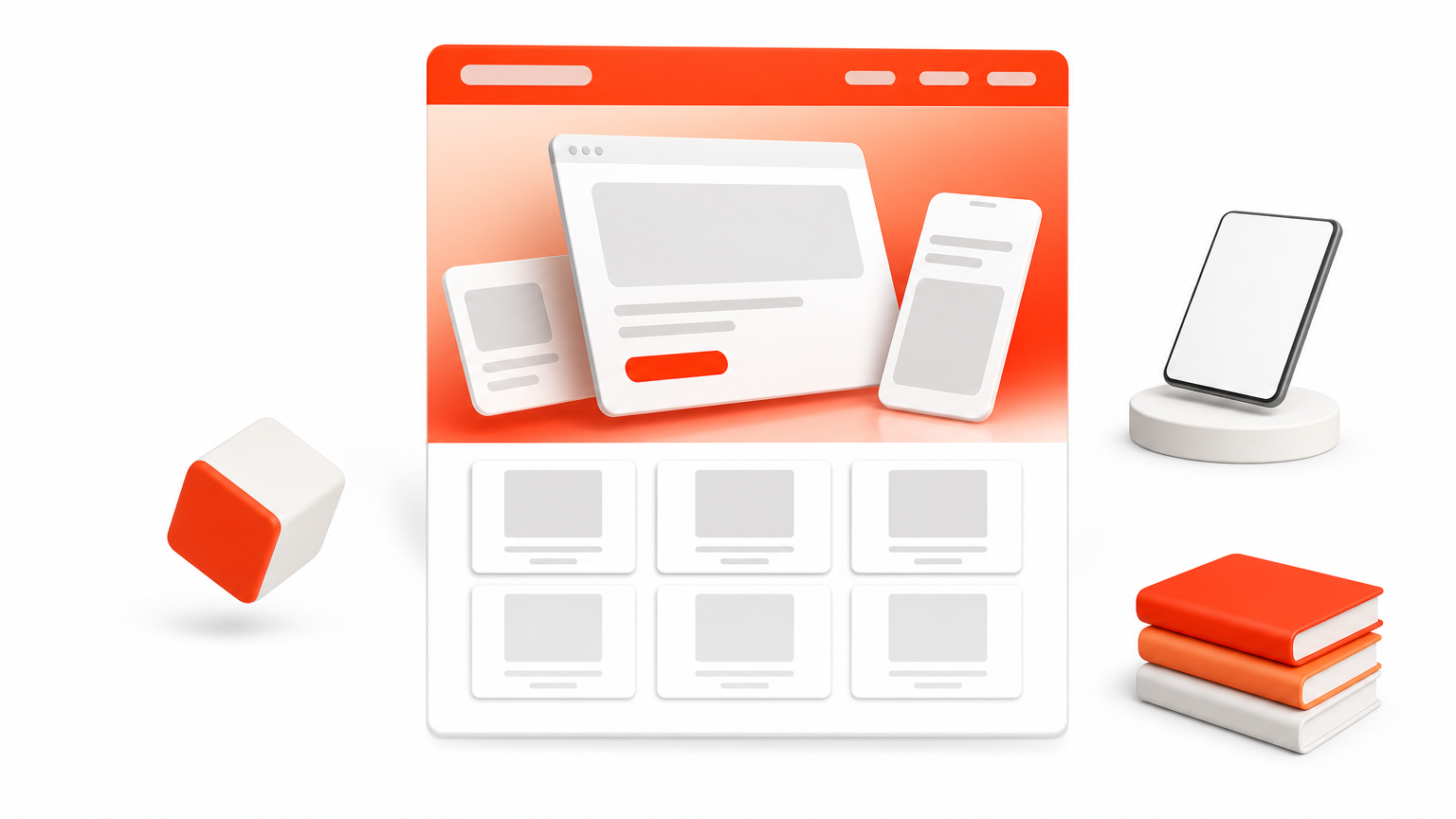
The featured post plus card grid is the safest blog layout design for a site that publishes on a schedule. One large story sits on top and equal cards sit below it. Readers see your best article first and your newest posts right after.
How it works
Start with a wide hero slot that shows one featured article with a large image, the title, and a 20 to 30 word excerpt. Below it, place cards in a grid that drops from three columns on desktop to one column on phones. Give every card the same image ratio so the rows stay even.
- Featured slot: image, category, title, excerpt
- Card: thumbnail, category label, title, date, read time
- Feed footer: numbered pagination or a load more button
A featured slot gives every visitor one obvious place to start.
Who it suits
Company blogs, SaaS blogs, and agencies use this pattern because it gives new visitors a clear starting point. Returning readers scan the cards in seconds and spot what changed since their last visit. The grid also scales well, since it still looks tidy at 200 posts.
Mismatched thumbnails are the usual weakness. Crop every image to one ratio, such as 16:9, before you upload. Otherwise the grid looks messy and unfinished.
How to build it in Divi
In Divi, open the Theme Builder and create a template for the blog archive. Add a Blog module in grid layout, then put a ready-made Divi hero section above it for the featured story.
- Create an archive template in Theme Builder.
- Add a Blog module in grid layout beneath the hero.
- Set one consistent featured image size in your media settings.
- Check the grid at tablet and phone widths.
2. Single column feed
A single column feed is the best blog layout design for personal and writing-first blogs. Posts stack in date order, each with a title, an excerpt, and a link. Nothing competes with the words.
How it works
Keep the column narrow, about 680 to 760 pixels, so lines stay easy to read. Show a small thumbnail or none at all. Lead each entry with the title, then the date, then a two or three sentence excerpt that gives readers a reason to click.
- Title in the largest type on the page
- Date and category on one muted line
- Excerpt of two or three sentences
- A plain read more link
A narrow column tells readers the writing is the product.
Who it suits
Writers, consultants, and solo founders get the most from this layout. The feed feels like a journal, and trust builds through a consistent voice rather than visual polish. It also loads fast, which helps on mobile connections.
Large archives are where it breaks down. Past a few dozen posts, readers cannot browse by topic. Add a category menu or a search field to the header before that happens.
How to build it in Divi
Divi’s Blog module has a fullwidth layout that stacks posts one after another. Use it inside an archive template, then limit the row width so the text column stays narrow.
- Add a Blog module in fullwidth layout.
- Set the row’s max width to roughly 720 pixels.
- Raise body text to 17 or 18 pixels.
- Add a Search module to the header.
3. Content plus sidebar
A content plus sidebar layout works when you want readers to do more than read. The main column carries the article. A narrow column carries a signup box, search, categories, or an offer. This is a classic blog page layout design that still earns its place.
How it works
Use roughly a two-thirds to one-third split. Keep the sidebar to three or four blocks, because every extra widget pulls attention away from the article. Put the most valuable block at the top, which is usually an email signup.
- Email signup form
- Search field
- Category list or popular posts
- One offer or banner
Every sidebar block you add takes attention away from the article.
Who it suits
Affiliate sites, niche publishers, and blogs that grow an email list use it well. On desktop the sidebar stays in view and gives you steady, low-pressure spots for conversion.
On phones the sidebar drops below the article, where few readers ever reach it. Treat the end of the post as your real mobile sidebar. A Divi CTA layout placed there keeps the offer visible to phone readers.
How to build it in Divi
Divi supports sidebars through its page layout settings and the Sidebar module. In Theme Builder, you can place the module beside your post content in a two-column row.
- Create a post template in Theme Builder.
- Add a two-column row with a 2/3 and 1/3 split.
- Put the post content in the wide column.
- Add your signup form and search in the narrow one.
4. Magazine style topic sections
A magazine layout groups posts into topic rows, each with its own heading and a few cards. It is the right blog design layout when you cover several distinct subjects and readers care about only some of them.
How it works
The page opens with a lead story, then runs a series of category bands. Each band has a heading, one larger post, three smaller ones, and a link to the full category. Readers jump straight to the topic they came for.
- Lead story or slider at the top
- One band per category, four posts each
- A view all link at the end of each band
- A compact most read strip near the bottom
Category bands let readers skip straight to the topic they came for.
Who it suits
News sites, multi-topic publishers, and agencies that blog about several services benefit most. The structure organizes a large archive without forcing readers to use menus.
The cost is upkeep. Someone has to curate the lead story and keep every band fresh, or stale rows make the whole site feel abandoned. Skip this layout if you publish less than weekly.
How to build it in Divi
Plan the page first with Divi wireframe layouts, then build each band as its own section. Divi’s Blog module can include posts from chosen categories only.
- Add one section per category.
- Place a Blog module in each, limited to that category.
- Set the post count to four.
- Add a button linking to the category archive.
5. Image-led visual layout
An image-led layout is a creative blog layout design for photography, travel, food, and design blogs, where the picture sells the click. Large visuals dominate, and text shrinks to a title and a category.
How it works
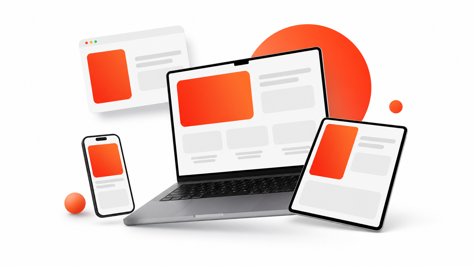
Tiles fill the width of the page in two or three columns. Heights can vary, which gives a staggered, gallery feel. Titles stay visible on the tile or directly beneath it. Do not hide them behind hover effects, because phones have no hover.
- Large, high-quality thumbnails
- Title and category under each image
- Generous gaps between tiles
- Minimal text elsewhere on the page
If the title appears only on hover, phone readers never see it.
Who it suits
Photographers, designers, chefs, and travel writers get the most from it. Visitors judge the work in a glance and click what catches the eye.
Page weight is the main risk. A page full of big photos gets slow quickly. Compress images and export modern formats such as WebP. WordPress already lazy loads images by default, so make sure your theme does not turn that off.
How to build it in Divi
Divi’s Blog module in grid layout already produces image-first cards. For a staggered look with uneven heights, you need custom CSS or a plugin.
- Use grid layout and show featured images only.
- Hide the excerpt and keep the title.
- Increase column gaps for breathing room.
- Test page speed with a real phone.
6. Reading-first post page
A reading-first post page is the most important blog post layout design you can get right, because search sends most readers straight to a post, not your homepage. It puts comfort and navigation ahead of decoration.
How it works
Use one column, about 680 to 760 pixels wide, with body text at 16 to 18 pixels and line height near 1.6. For posts over roughly 1,500 words, add a sticky table of contents so readers can jump around. Break text with a heading every 200 to 300 words.
- Title, author, date, and read time up top
- Table of contents on the side or under the intro
- Pull quotes, lists, and tables to break up text
- Author box, related posts, and one call to action at the end
A comfortable post page does more for engagement than any homepage trick.
Who it suits
Tutorial sites, agencies, and any blog with long guides should use it. Readers scan first and read second, so clear headings and a navigable page keep them from bouncing back to search.
Short posts do not need a table of contents. If an article fits on two screens, the extra element adds clutter and nothing else.
How to build it in Divi
Build one post template in Theme Builder and every article inherits it. Use dynamic modules for the title, featured image, and content, then add anchor links for the table of contents.
- Create a post template in Theme Builder.
- Add Post Title, featured image, and Post Content modules.
- Set the content row to a narrow max width.
- Pin the table of contents with Divi’s sticky options.
7. Funnel-style blog home
A funnel-style blog home turns the blog into a lead source. Instead of a bare feed, the page opens with a short promise, shows your best posts, and then asks for one action. It suits service businesses that blog to win clients.
How it works
Stack the page in bands. A hero states who the blog helps, followed by the latest posts, a single call to action, and a short FAQ. Each band has one job.
- Hero with a one-line promise and signup
- Latest or best posts in a card row
- One call to action band
- FAQ accordion for common questions
Give every band one job, and give the page one primary action.
Who it suits
Freelancers, agencies, and consultants use this layout because their blog supports sales conversations. Visitors learn who you are, sample your thinking, and see the next step without hunting for it.
Too many offers hurt it. If you show three competing buttons, readers pick none. Choose one primary action and keep everything else secondary.
How to build it in Divi
Divi makes this structure fast to assemble. Combine a hero, a Divi CTA layout, and a Divi accordion for the FAQ band. A Divi child theme keeps fonts, colors, header, and footer consistent across all of it.
- Add the hero and signup form.
- Insert a Blog module with three recent posts.
- Place one CTA band beneath it.
- Finish with an accordion of five questions.
How to design a blog layout that works
To design a blog layout that works, start with the post page, define one goal, sketch the structure, and build reusable templates. Visual polish comes last. This process applies to every layout above.
The elements every layout needs
Whatever pattern you choose, a few elements decide whether readers stay. Use this table as a checklist for your blog layout design before you launch.
| Element | What works | Common mistake |
|---|---|---|
| Header and menu | Logo, 4 to 6 items, search | Listing every category |
| Post title and meta | One H1, author, date, read time | Hiding the publish date |
| Body text | 16 to 18 px, 50 to 75 characters per line | Full-width text lines |
| Images | One ratio, compressed, alt text added | Oversized uncompressed files |
| Related posts | Three relevant cards after the article | Random or unrelated links |
| Call to action | One clear next step | Several competing offers |
| Footer | Archive link, signup, legal links | Empty or overcrowded footer |
A six-step design process
Work from content to decoration. A sketch on paper beats an hour in a design tool, because it forces you to decide structure before style.
- Write down the one goal of the blog, such as subscribers or inquiries.
- Sketch the post page, then the blog index, in boxes.
- Choose one of the seven layouts above for the index.
- Build the post template first, then the archive.
- Test on a real phone and fix spacing and tap targets.
- Check page speed and trim heavy images.
Free blog layout templates and where to find them
Free Divi blog template layouts exist, and they are enough to start. WordPress’s default themes ship with usable blog templates, and Divi’s Theme Builder lets you shape your own post and archive templates at no extra cost once you own the theme. Divihat also runs free Divi layout giveaways and email freebies from time to time.
Free templates cost you time instead of money. You will spend hours adjusting spacing, mobile behavior, and matching styles. A premium Divi layout saves that time when you build for clients or on deadlines.
Pick one layout and build it
Good blog layouts share a short list of traits. They give readers one obvious starting point, keep text comfortable to read, and end every post with one clear next step. Choose the pattern that fits your content volume and goal, build the post template first, and fix mobile spacing before you polish anything else.
If you build with Divi and want a head start, the Divihat membership gives you premium Divi 5 layouts, hero sections, wireframes, and child themes to assemble blog pages faster, with unlimited website use and a 30-day money-back guarantee.